Clink! Creating Community through Connection
Team:
- Phoebe Huang: Designer and Researcher
- Michaela Smith: Designer and Researcher
- Vy Nguyen: Designer and Researcher
Problem and Solution Overview
The problem we focus on is the difficulty surrounding finding ways to engage in community life. Our CI review showed us that three main pain points felt by those looking to engage in community activities and events (both on and off campus) are related to 1.) convenience, 2.) accessibility of information, and 3.) personalization. These three points are closely connected, as convenience largely includes the ease with which information can be attained and the degree to which the things you learn about are tailored to your interest. It also involves other difficulties, such as scheduling activities you’d want to do with others, and the tedious work of keeping track of which events you’re interested in. As a result of these findings, our solution focuses on mitigating these constraints. It will be in the form of a mobile app, and will provide the user with customizable, personalized information about events near them. The main purpose will be to increase the ease with which users can access and save information, and to limit the information they receive to a manageable amount. Events can be tagged to a physical location, so users can see on a map where events take place, or become aware of something they may not have known about otherwise. For users who want to do as little work as possible, the app will also be able to give recommendations about what events are a best match based on the user’s past selections and ratings. This means that with almost no effort on the part of the user (they do need to set up their preferences), they would still be able to get personally tailored event recommendations that fit their schedule.
Initial Paper Prototype
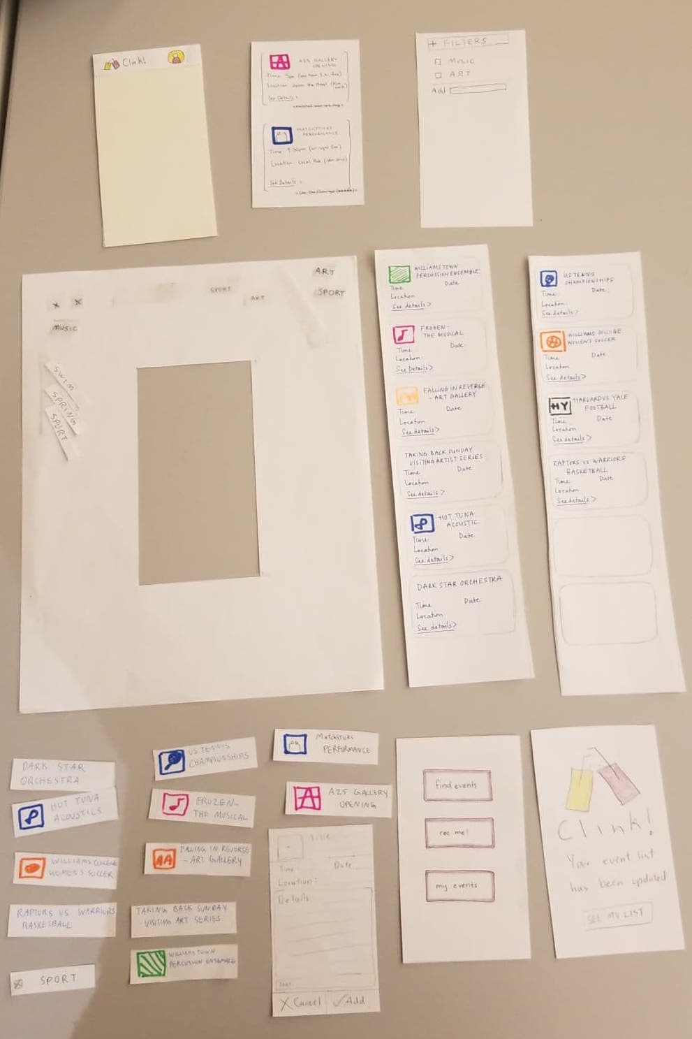
Our initial paper prototype focused on two main tasks: finding an event based on a user’s preferences and automatically recommending events of interest that fit into the empty slots of a user’s schedule.
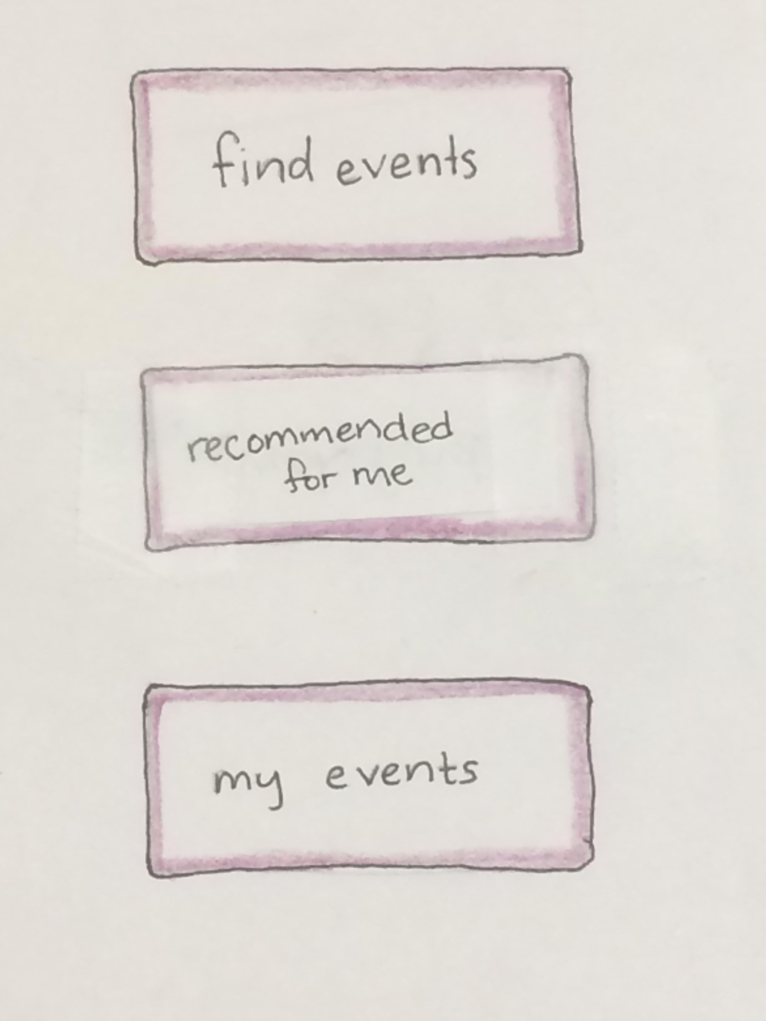
To make starting these two tasks easier for our users, we created a home page with three buttons, two of which corresponded to our two tasks (‘find events’ and ‘rec me!’) and one that showed the list of events the user has chosen (‘my events’).
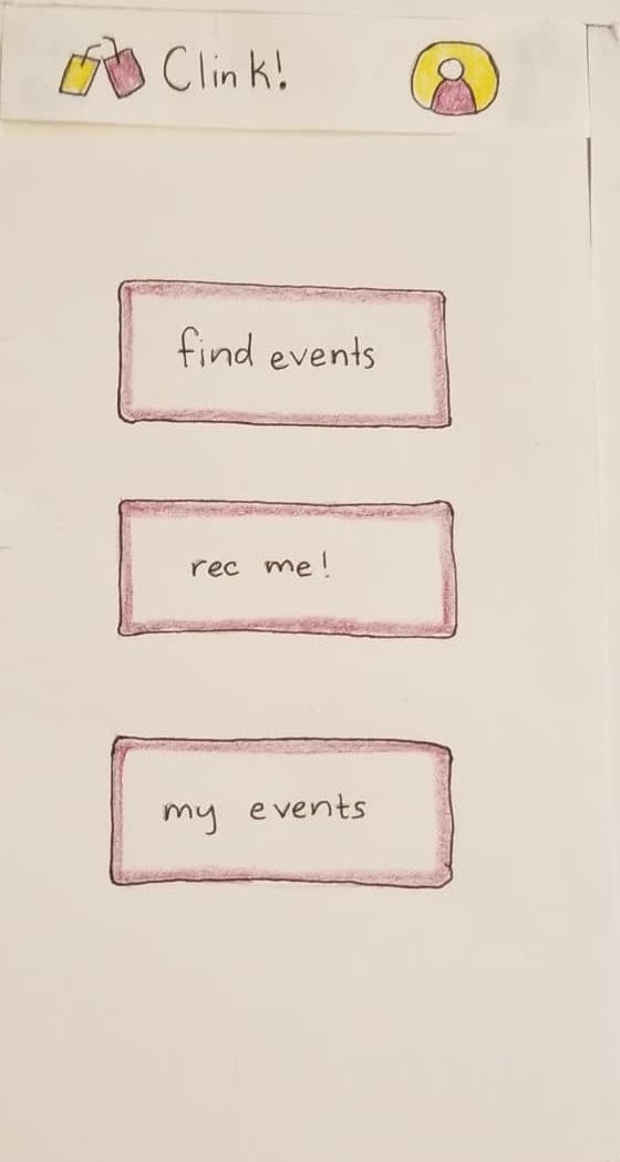
We also created a header that would appear on every page of our app with our app name, Clink!, and our logo, so that the user can return to the home page by clicking the logo or app name on any page. The header also has a profile icon that theoretically led the user to an editable profile page with all the user’s more permanent interests, although this was not implemented in our initial prototype as it was not relevant to completing either of our tasks. To complete task one, searching and filtering for events, a user starts by clicking on the find events button to get a scrollable list of all events available that fit the user’s profile preferences.
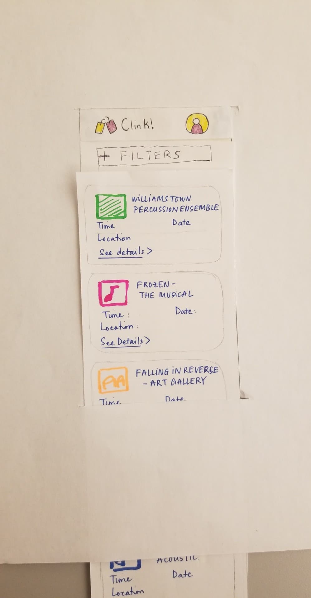
Clicking the filter button expands the filter editor. This prototype’s ‘user’ has filters for art and music chosen already. Additional filters can be added by typing into the text box next to “Add” and selecting from the tags that pop up. Filters can be removed by clicking the ‘x’ next to their tag.
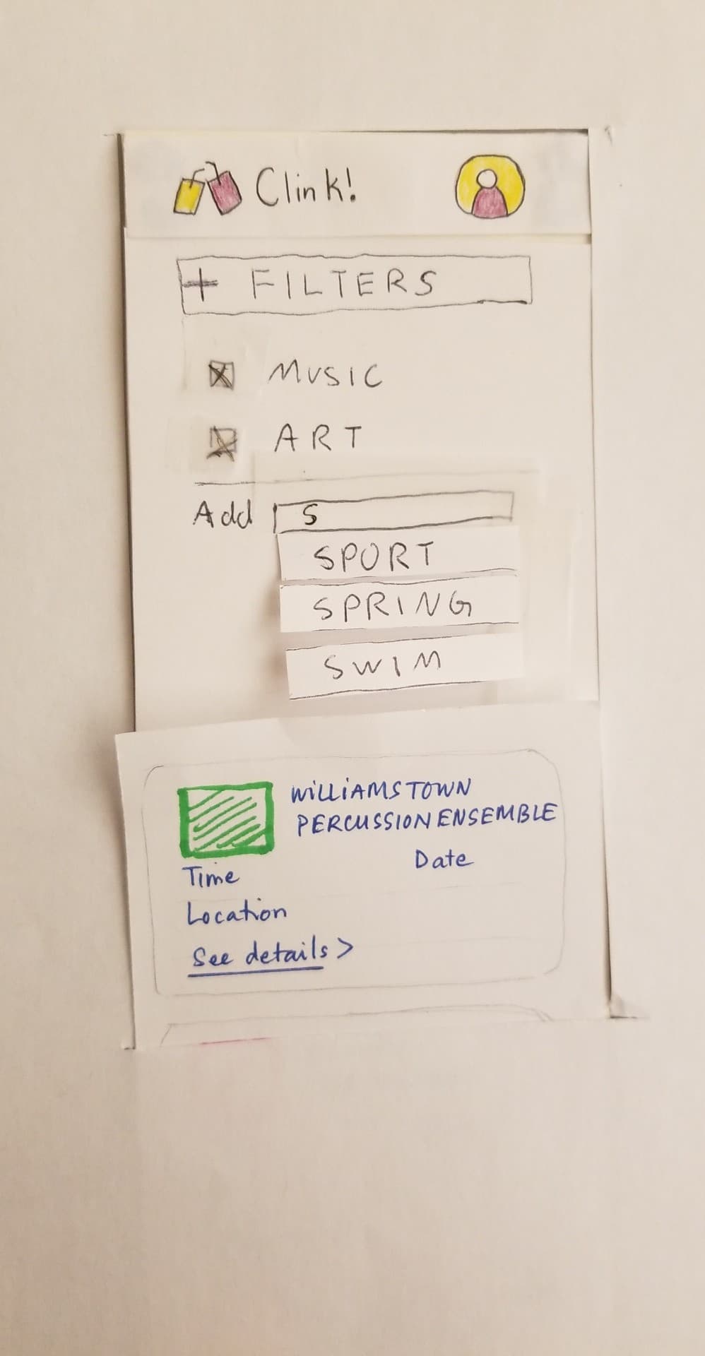
Tapping the filter button again contracts the filter editor and applies the filters. The list of events is automatically refreshed upon filter application. Clicking on an event leads to a page with a more complete description of the event and “Add” and “Cancel” buttons.
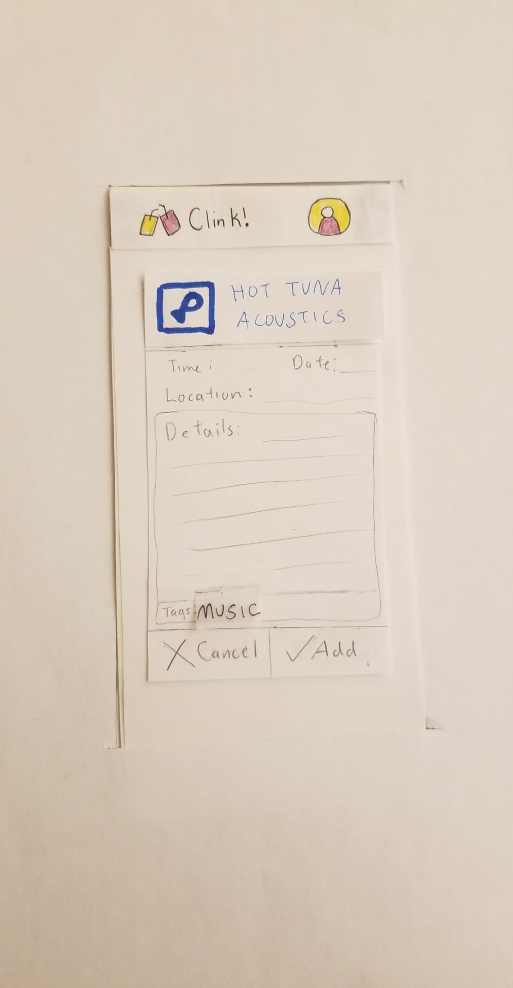
Clicking “Cancel” takes the user back to the list of events and clicking “Add” adds the event to the user’s event list and shows the user a confirmation page.
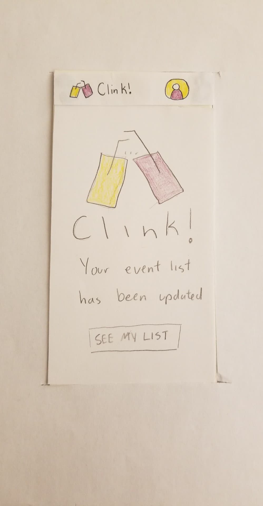
The “SEE MY LIST” button leads the users to their event list, but we did not implement that in our initial paper prototype because it was not relevant.
Our second task was to find and add a recommended event to the event list, so to start, the user would need to click on the “rec me!” button on the home page.

This would take them to the recommended event page, where there are two events that the algorithm as chosen as the best fit for the user based on preferences and schedule.
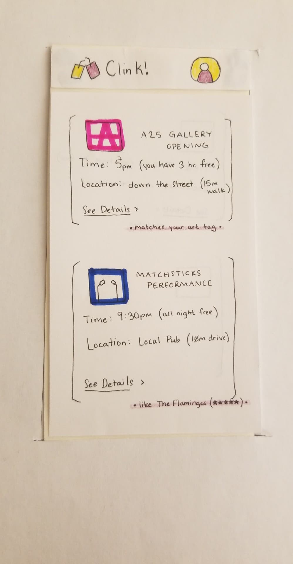
Clicking on an event leads to a detail page like before, where the user can add the event to their event list or cancel and go back to the recommended event list.
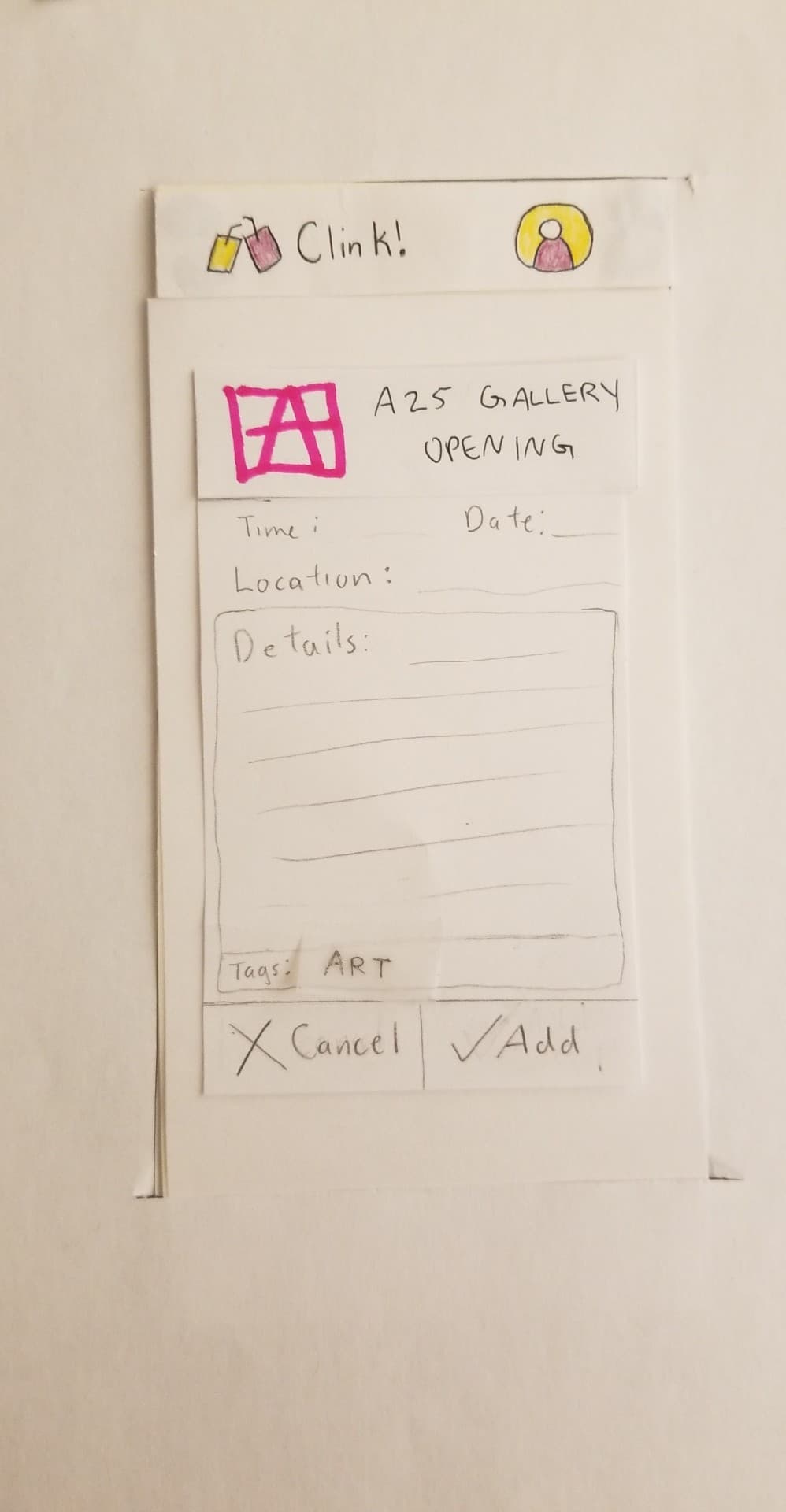
Clicking “Add” adds the event to the user’s event list and bring them to the same confirmation page as before.

Testing Process
We first conducted a heuristic evaluation of our prototype with LB and GS to determine if we had elements that broke heuristics and would serve to confuse our users if left uncorrected. We conducted these evaluations by having LB and GS, both Williams students in our HCI class that were familiar with the design process and heuristics that designs should follow, test out and explore our paper prototype as they saw fit. After the heuristic evaluations, we made changes to our prototype and conducted a cognitive walkthrough of two tasks we planned to have our usability testers complete. The first task was to add a sports event to the event list and the second task was to add a recommended event to the event list. We noted several potential issues in our design that would complicate a user’s decision to complete a certain action required for the task and made edits to our prototype to fix them. After the cognitive walkthrough we conducted three usability tests with Williams students TN, AA, and KS. For each usability test, we gave our tester an overview of what Clink! is, how it came to be, and what it can do. This exposition was changed slightly after every test, as we realized we weren’t giving the testers enough explanation about the product they were testing at first or were explaining it in a confusing way. We then explained to them what the two tasks they would be walking us through were. Task one was to assume they were a user that usually like art and music, and to add a sports event to their event list. Task two was to find and add a recommended event to their event list. For every test, the designer most familiar with the tester acted as the computer to give the tester a sense of comfort as they proceeded through the activity and a designer unfamiliar with the tester acted as the facilitator to decrease potential bias.
Testing Results
As described above, our first use of the paper prototype was in two heuristic evaluations. The feedback from these evaluations was largely related to the interactivity allowed for in the prototype itself, rather than about the actual app design. This was because we had initially only implemented features that we felt were directly relevant to the completion of the two tasks. We quickly learned that this was an unideal approach because it didn’t allow users to test the flow of the app naturally; we could not see the ways in which their ‘path’ to completing the task was different than what we as the designers expected, since the interactions allowed for artificially constrained them to our approach. We changed this by allowing for more actions. We also changed the text on our recommendation button from “rec me!” to “quick find”, since our user found the term “rec me!” confusing. Our next three tests were usability tests. The user in our first test found the phrase “quick find” confusing, because it was not clear how it differed from the more descriptive “find events” button marking our other task. This showed us that we did not fix the ambiguity issue as well as we thought, so we then changed the wording from “quick find” to “recommended for me”. Our final rounds of user testing revealed that there was still some confusion regarding this functionality, so we added a (?) icon that the user could click for a more detailed description of the feature. The other main change that was iteratively improved over the course of our user testing was the filters menu. Our first tester was unsure whether filters would be automatically applied, so we added an explicit “apply” button to the page. Our second tester, however, was confused by this, because we had left the original (x) button as well; they were unsure of the difference. This made sense, because though we had thought of hte (x) as a ‘cancel’, or ‘back’ button, the design did not make this feature clear to the user. We altered this to change the (x) button to say “cancel”. We also positioned it on the page directly next to the apply button, and weighted it equally, so it was clear that the user would choose either one or the other.
Final Paper Prototype
Like our initial prototype, our revised version focused on the same two tasks: finding events through user filtering and automatically recommending events most fitting to the user, both in terms of time and interest.
Our home page still features three main buttons, though the wording of the second has changed as a result of user testing.
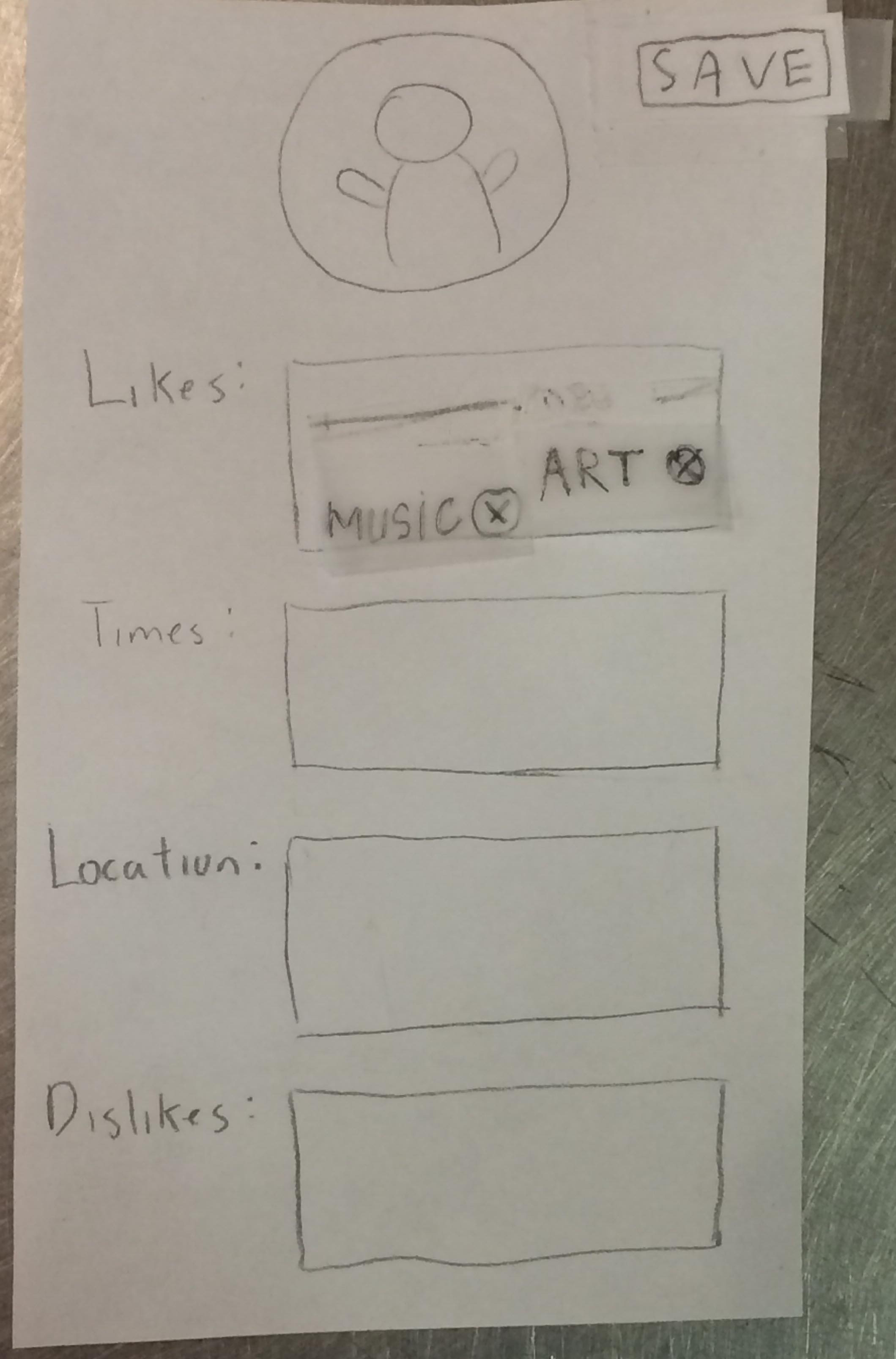
The navbar icons are all clickable: the person icon takes the user to a profile page, and the “Clink!” icon takes the user to the main homepage if they have navigated away from it. The profile page was not implemented in the initial prototype, but was in our final version as a result of user testing feedback.
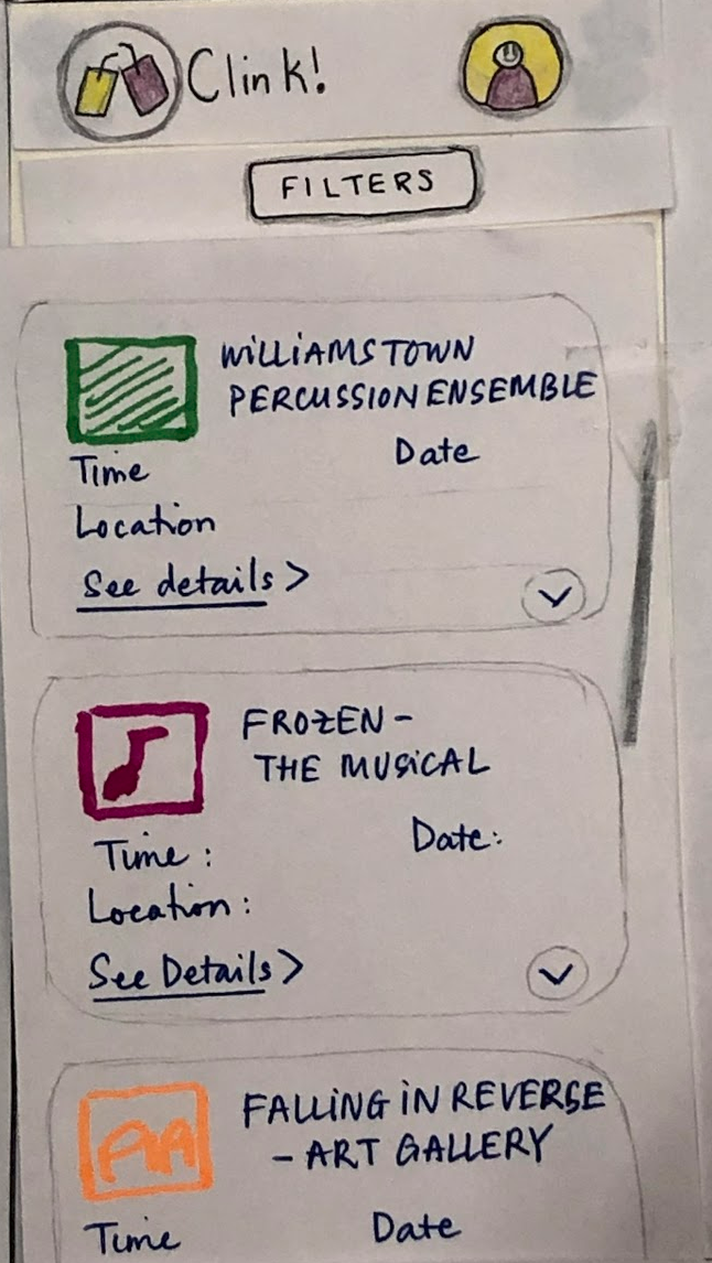
From the home page, the user can select “find events” to search and filter available events.
Clicking on “filters” expands the filter menu. This allows the user to change the default filters, which are set in the profile. This is similar in functionality to the initial prototype, but the design has changed to address feedback from user testing, as described above.
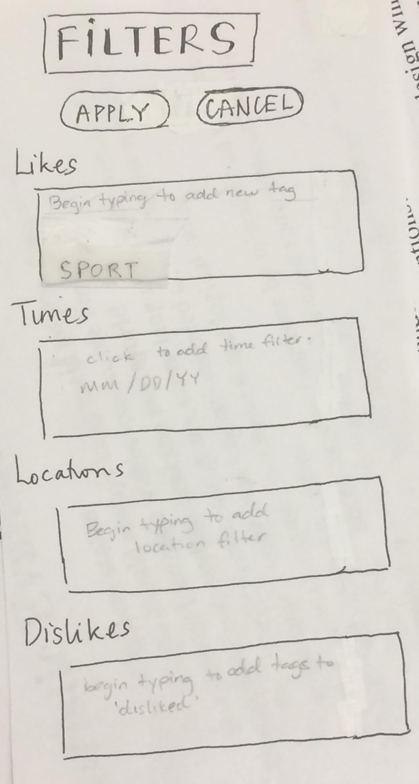
Selecting “apply” collapses the filter menu and updates the event list to fit the changes. Selecting any of these events takes the user to a detailed event page. As before, selecting “add” adds the event to the user’s personal event list.
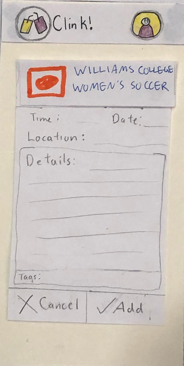
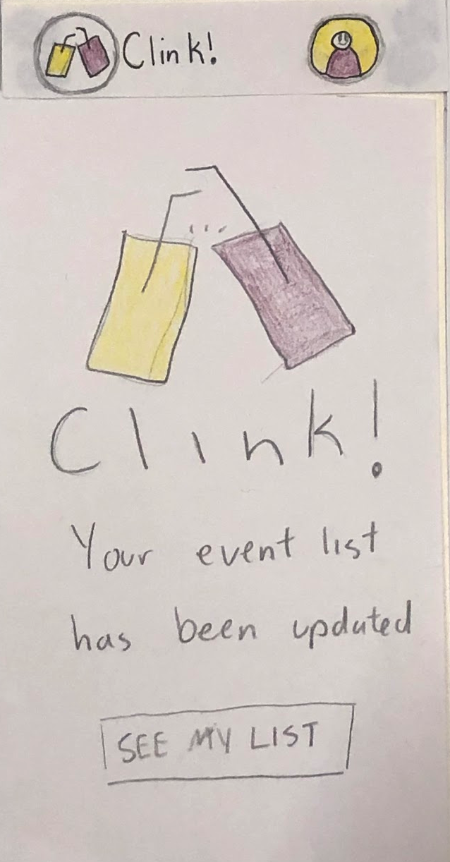
To complete the second task, the user selects “recommended for me” from the main menu. This loads the recommendation page.
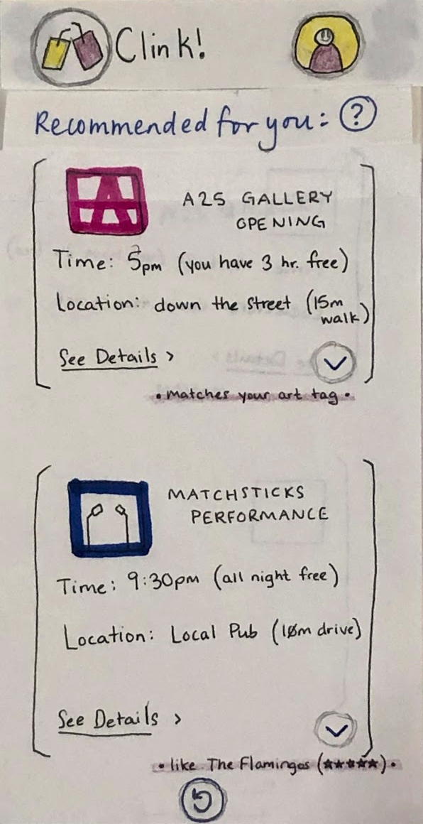
Since the functionality of this feature was slightly confusing to our testers, we added an information page. This can be accessed by selecting the (?) icon.
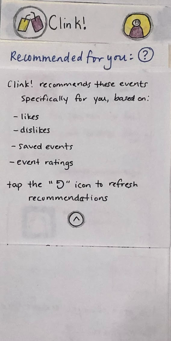
This page can be collapsed by tapping the (^) icon. This takes the user back to the short list of recommended events. This can either be refreshed (to generate new recommendations) or, as in the previous task, the user can click on an event to view details or take additional actions.
Digital Mockup
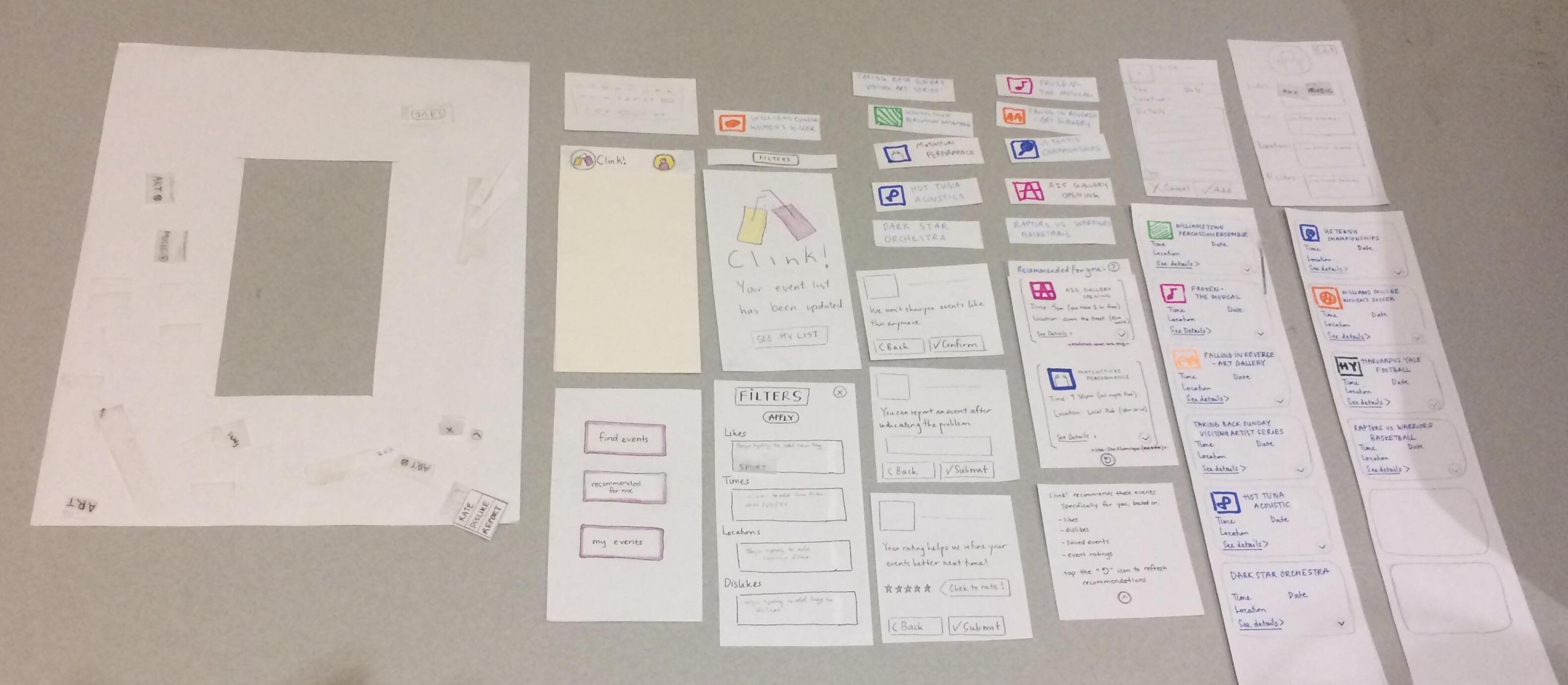
Below is the overall overview of our digital mockup
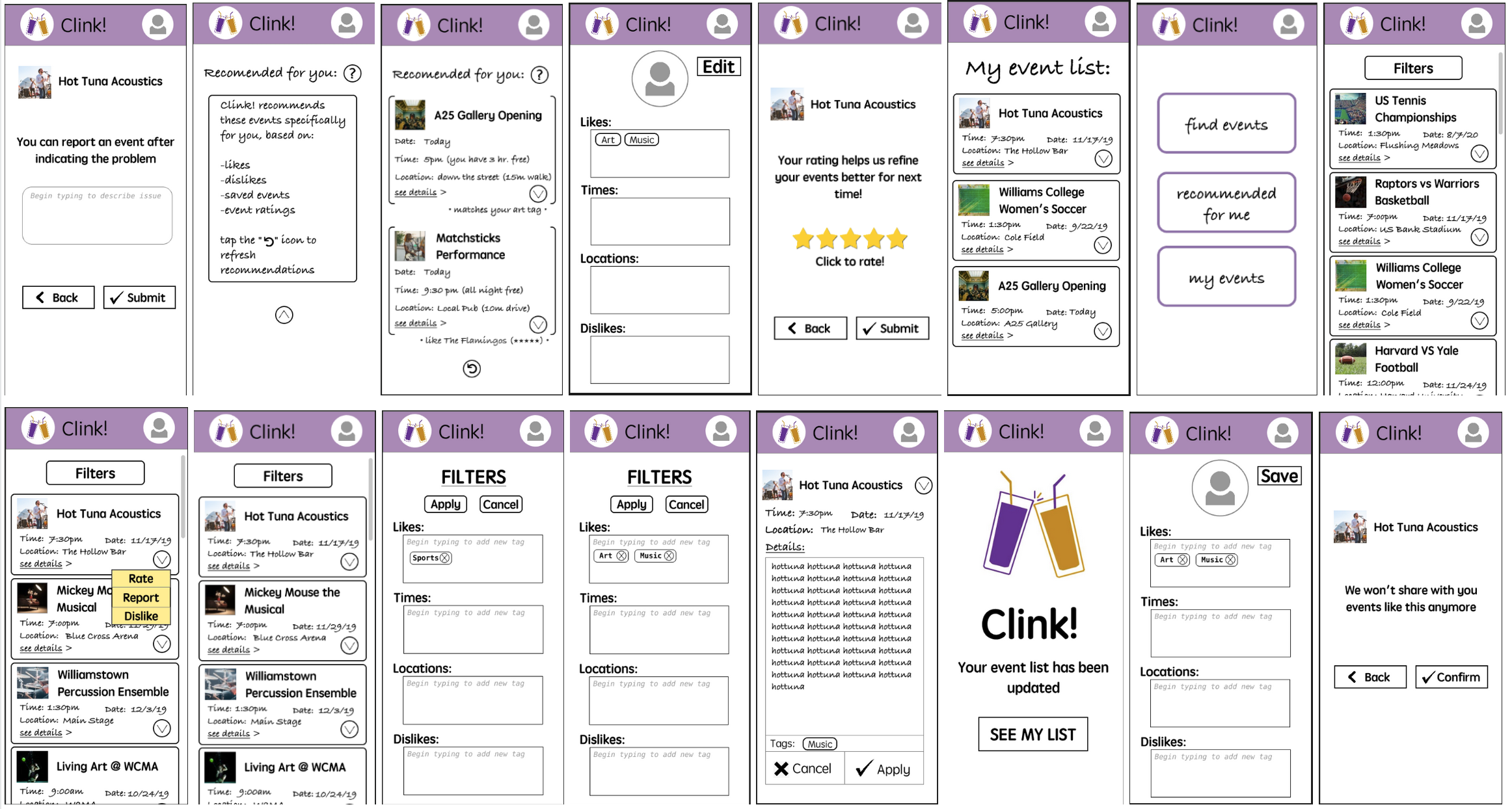
For our digital mockup, we are able to expand our prototype more and produce the most realistic version of our product so far. We added some specific sections such as “my event list”, “report”, “rating” and “dislike” pages, as well as some help buttons and clarification areas to help guide our users. During the usability testing, our testers were hoping they could interact with these sections of our prototype. Although these added sections are not related to our 2 primary tasks, we think they assist greatly in providing a more complete feel of our product and its functionality.
For the first task, our current design have a clear find events section that the user can tap in and go to the event list that has been filtered according to their default interests. From here, we designed our “FILTER” button at the top of the page so it can easily be seen that the user can add in temporary filters if desired. After that, they can easily see the details and add the event to their event list.
For our second task, our home page also has a section that points to the recommended events page of our app, “recommended for you”. Here, in case the user is confused about the functionality of this session, there is a question mark sign that the user can tap in and get information about the purpose of this session. After that, they can choose to add a recommended event to their event list or refresh the page in order to get two new recommendations.
Discussion
We found that updating our prototype after usability tests made it so that our later testers were more able to see different, unrelated issues. Maybe our earlier testers didn’t pick up on these things because they seemed more subtle compared to the things they did tell us, which we were then able to fix before the next test. This allowed us to uncover more problems. The iterative process was also valuable because there were several times (e.g. the filter menu) where our revisions were not as comprehensive as they needed to be, although we had thought while designing the changes that we had addressed the issues the tester identified. Another example of this is the phrasing for the recommendation button: we went from ‘rec me’ to ‘quick find’ to ‘recommended for me’, and even with this last wording, we found it advantageous to add an information button that the user could click to get a more complete explanation. We also discovered that some people were able to complete the tasks quicker and with less confusion than others, even when they were given the same information. Iterative testing allowed us to find these weak spots in our design that prevented parts of our user base from completing their tasks. Had we not done iterative testing, we could have missed these issues.
We found out through the process of usability testing that the testers have trouble understanding our filter and profile editing section. They were mostly confused about how to actually edit the profile and weren’t sure whether they could provide input at certain steps. As a result, we redesigned this section in a much more comprehensible way by marking clear areas that need input and moving some buttons up to the top (APPLY) so it’s more visible and clear the next step in completing their task. Our filter element went from a drop down editor into a full page with more comprehensive instructions and buttons. The most apparent problem we had during the process was our user having problem understanding the naming of finding recommended events (originally called “quick find”). We thought this naming was clear at the beginning, but since all three of our users pointed out this confusion, we decided to change it into “recommended for me”. Originally, we wanted to avoid this long name and use something short and fun, but through our iterative process, we discovered that our users didn’t understand our quirky names and that a more literal label would be most effective. An extra feature we also added to our digital mockup is the “My event list”, “Rating”, “Reporting”, and “Disliking” page. During the usability testing, our user testers kept clicking on buttons that led to these pages, which were not in our prototype originally due to not relating to completing the tasks. By adding them to our prototype, we think it helps give the user a more comprehensive view of what our product is doing behind the scenes to generate recommendations. Overall, our final design has a lot more “help” buttons where a user can click a button to get an explanation of the purpose of a page, and a lot of our interactive components were made more obviously interactable in appearance, either with grey text for text boxes or buttons with more descriptive labels. Many of our design elements went through several changes, each proven to be insufficient by the next usability test conducted. Our final product is a more comprehensible, informative app compared to the minimalist design we prototyped first.
Our tasks remain the same after the usability tests because we think they’re comprehensive enough to explore the two main functions of our product: Event searching/filtering, and event recommending. One main issue was that we found out after our first usability test the user tester was confused about whether they’ve completed the delegated task. We realized we needed to provided clearer differentiation between the tasks, and better explanations (through the design) of why one was different than the other and how they were each uniquely useful for different situations/goals.
More iterations could have been helpful for our design process, especially if we can do usability testing with our digital mockup. For our paper prototype, we were able to get comprehensive feedback on the main components of the design, but we did not focus on more subtle aspects at all. For example, color choice, icon/ text size, etc were never mentioned. Our user testers were much more focused on the core features and functionality. However, being able to test with more users and asking them more questions about these subtle details would help us further improve the user experience.