Our Tests
Test 1
Our first usability test was conducted with a student, TN, on the evening of November 6th in Eco Cafe. TN is a student who plans to go into computer science and we chose them for their familiarity and interest in technology. We chose to conduct the test in Eco Cafe because it is relatively quiet in the evening and is a familiar and convenient space for TN. During this test, Vy was the computer and Phoebe was facilitator. Phoebe explained the general purpose of the app, the tasks, and asked TN to explain their thought process as they navigated through the app. The app was described as a tool to help users find events they are interested in. TN was told that each user gets a profile page where they can set fixed preferences for events. They were also given a brief introduction to the recommendation system, where the app has integrated the user’s personal calender and recommends events that fit into detected blocks of free time and the user’s fixed preferences. The tasks given to TN were:
- You are a user of the Clink app with the fixed preferences set for art and music. Find and add a sports event to your event list.
- Add an event from the recommendation list to their event list.
We discovered through this test that TN had a hard time figuring out what the difference between “find events” and “quick find” was, which led us to add an information button to the recommendation page that would load a pop up explanation of the recommendation system to the user when clicked. Another major problem we found was that editing the filter was very unintuitive. We restructured our filter page to have an “apply” button at the top and kept all the tags in one text box that would also double as a text box to type in. Lastly, the header icons for the home page and the profile page both were interpreted as purely decorative instead of as links. We tried to make them more recognizable as clickable icons by adding a circle around the Clink! logo and adding a smiley face to the profile icon to make it look more like a person.
Test 2
Our second usability test was conducted with AA, a student, on November 9th at Eco Cafe. AA is a political science and sociology major. We chose AA because even though they don’t study technology, they are an avid user of it. We chose to meet in Eco Cafe again because it is a quiet space in the evening and was a familiar place for AA. For this test, Michaela was the facilitator and Phoebe was the computer. Michaela explained the app to AA in the same format as the first test and the two tasks we asked AA to perform were the same as the ones in the first test. This time, Michaela explained the tasks with a bit more detail, noting that for the first task that music and art were in the profile preference because those are the activities AA (or the persona AA was taking on) usually liked, but wasn’t interested in for this specific search, and that for the second task, AA wants to add something that the app’s internal algorithm recommended. This test revealed several issues, shown on the table for user test two. Of these, the difficulty in recognizing the difference between the “apply” and the “(x)” button on the filter page was the most surprising, since we had added the “apply” button as a response to confusion in the last user test. Watching AA talk through their thoughts made it clear, though, how this revision needed to be more well thought out.
Test 3
Our third usability test was conducted with KS, a senior history major, on November 10th in Paresky. This location was chosen because it was most convenient for KM. We chose this student as our third tester because of their interest in app design and willingness to give open, critical feedback. Vy was the facilitator and Michaela had the role of the computer for this test. The structure of this test was mostly the same as that for the last usability test, since we felt that the scenarios given in the second test were descriptive enough to be helpful without giving too much away. As the facilitator, Vy only stepped in to give any comments to the tester when they had already told us their thoughts about what they were seeing and asked a specific question. This only happened once, when the user was confused about the function of ‘quick find’ and tried to edit the profile instead. It became clear from the way they expressed their thoughts that they believed this was accomplishing the task we wanted, and so Vy stepped in to refine the description of the task. This allowed them to overcome the misunderstanding and complete the rest of the task independently. This misunderstanding of the quick find feature was the main design issue this test revealed. It was also confusing to our user that the event list page was not implemented, as they thought that the event list would be relevant for finding event recommendations. Though this is relevant for the recommendation system, it was not relevant for the user to see for the purposes of these tasks. We will be implementing this feature in our digital prototype. For each of our tests, the group member that was familiar with the tester and asked them to participate acted as the computer. We chose this testing set up because the computer does not give any human responses to the tester during the testing process, but we thought it would be more comfortable for the tester to have someone they were familiar with at the testing site. We hoped this would ease any nervousness the testers had without introducing any bias into their performances.
Results
Test 1
| problem | severity |
|---|---|
| 1. Not clear whether filters will be applied when added | 3 |
| 2. Not clear that user is meant to type in filters page | 2 |
| 3. Not clear that header icons could be clicked | 2 |
A more detailed description of these issues and how we resolved them can be found here.
Test 2
| problem | severity |
|---|---|
| 1. Unsure about the difference between “apply” and “(x)” on filter menu | 4 |
| 2. (Still) not clear that user is meant to type in filters page | 2 |
| 3. Meaning of “quick find” unclear | 4 |
| 4. Function of “rate” unclear– how is it different from like/dislike? | 3 |
Issue 1: Unsure about the difference between “apply” and “(x)” on filter menu
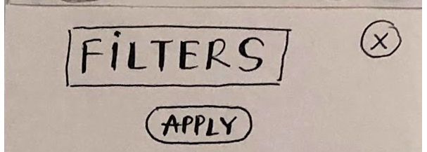
AA described their thought process while trying to change the filters during task 1. They edited the filters in the text box but weren’t sure of what the best way to save and exit from the filters page. They thought clicking the “(x)” button might also apply their changes, which it doesn’t. There also was an apply button that they thought would save the filter and did end up clicking on that instead, but the initial confusion is something we want to avoid in our design. If AA had clicked on the “(x)” instead, they would have had to do a lot of extra work to get to back to the point where they can try the apply button.
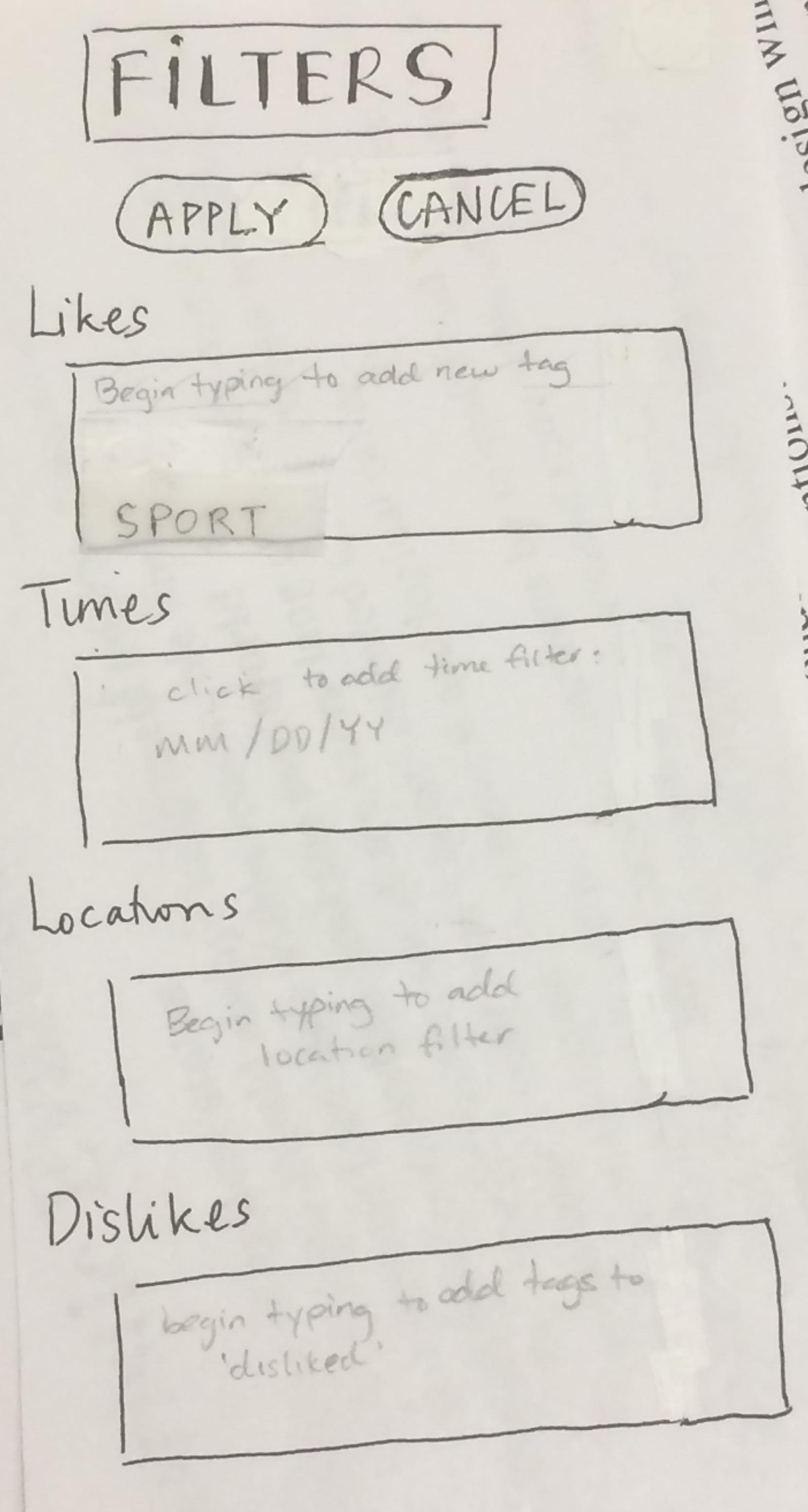
We revised our filter page to have an apply button and a cancel button, getting rid of the “(x)” button. We hope this makes it more clear to the user how they should save their edits.
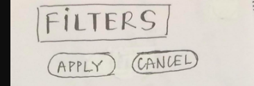
Issue 2: (Still) not clear that user is meant to type in filters page
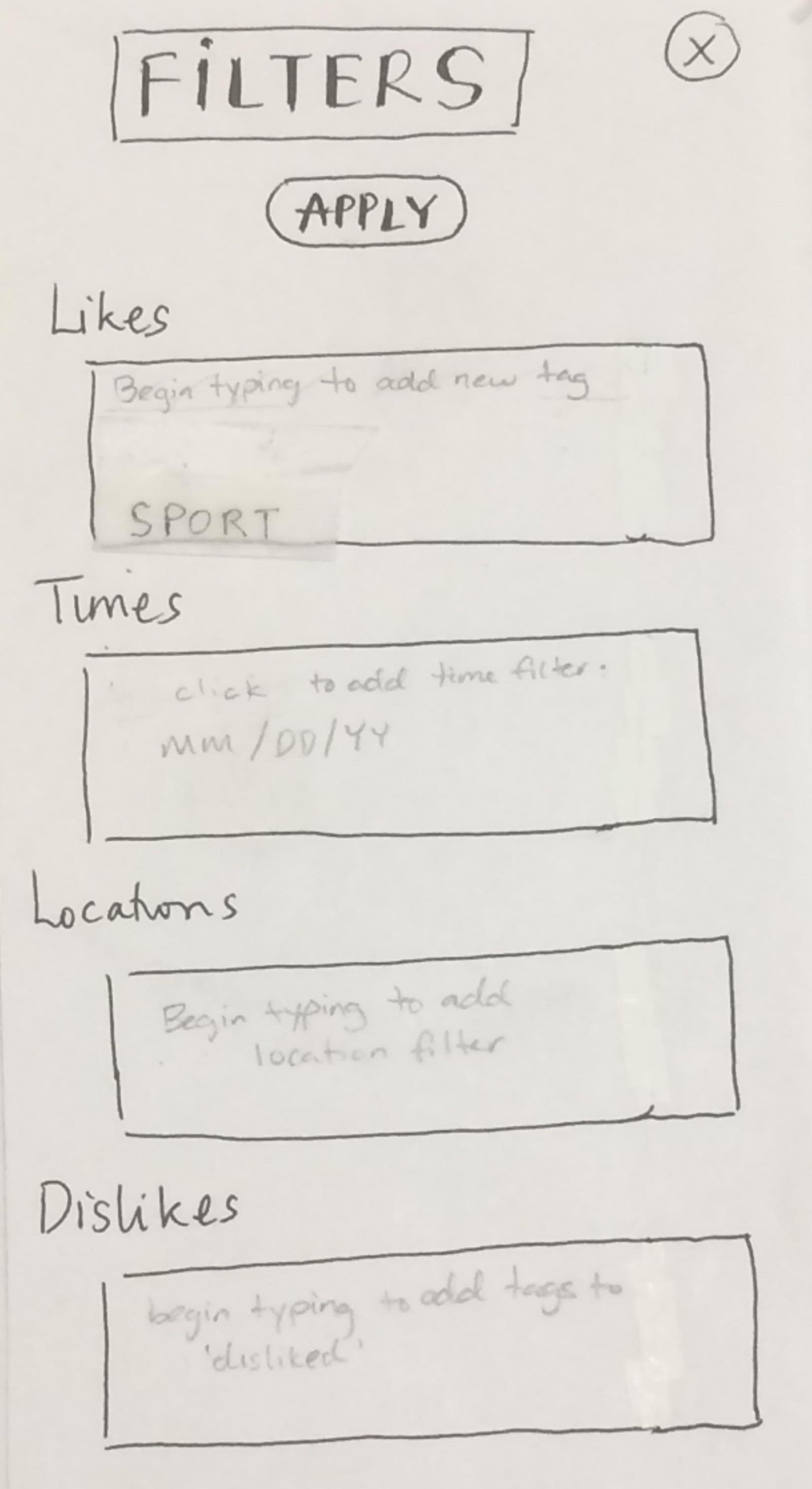
It took a while for AA to figure out how to create a new tag on the filter page because it was not clear how the user could type into the text box we had prepared. They eventually figured it out without prompt, but only after several rounds of opening and closing the filters page and tapping around the screen to find a trigger for typing.
We revised our prototype so that there was greyed out text at the top of each text box that described what the users could type into the box. We hoped this would signal to the user that the box could be interacted with and that it was where new filters should be typed in.
Issue 3: Meaning of “quick find” unclear
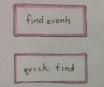
During task 2, AA was able to figure out what “quick find” was but noted that it was unclear during their testing process. They explained that it was not intuitive to click to find recommended events.
We implemented the revision to this issue after completing test 3, in which it also came up (see issue 1 under test 3 below).
Issue 4: Function of “rate” unclear– how is it different from like/dislike?
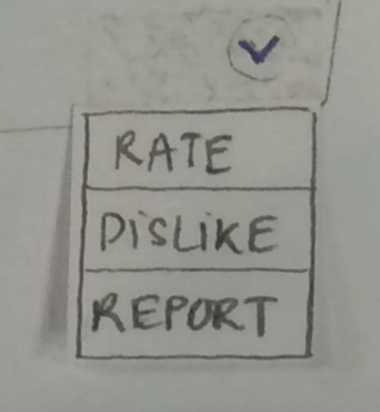
AA clicked on the drop down button during testing but did not interact with the menu because they were able to immeadiately realize it didn’t have anything to do with their task. However, they did mention that, at a glance, they didn’t really know what clicking “rate” would do and how it would be different from clicking “dislike” instead.
Test 3
| problem | severity |
|---|---|
| 1. Meaning of “quick find” unclear | 4 |
| 2. Would be helpful to have “events list” implemented | 2 |
Issue 1: Meaning of “quick find” unclear

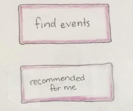
KS couldn’t tell from the name that “quick find” was a way to find recommended events. They thought had to go to the profile to find recommended event, similar to how Spotify shows its users recommendations under the user’s playlists.
We replaced the text on the button in question to say “recommended for me” instead of “quick find” so that it would match our users’ mental models.
Issue 2: Would be helpful to have “events list” implemented
KS had a mental model of the recommended events being shown in the same manner as Spotify’s recommended songs. On Spotify, recommended songs are shown to the user at the bottom of a user’s playlist, thus, KS thought that recommended events would be shown at the end of the user’s event list, which we had not prototyped because we thought it was irrelevant to the tasks we chose.
We did not make a direct change to this, although in our high-fidelity prototype we may have it implemented. We hope that by having a more intuitive button for recommended events on the home page, users’ mental models will shift somewhat to fit with what they now know about the app’s structure.
*Note: the change addressing problem two from the second user test (adding greyed out text signifying that the user can type) was implemented after user test 2, before user test 3, since it was the most severe hinderance that we observed in test 1 and 2.)
Revised Prototype: Task Walkthrough
After all of our revisions, below is the overview of all our prototype components:
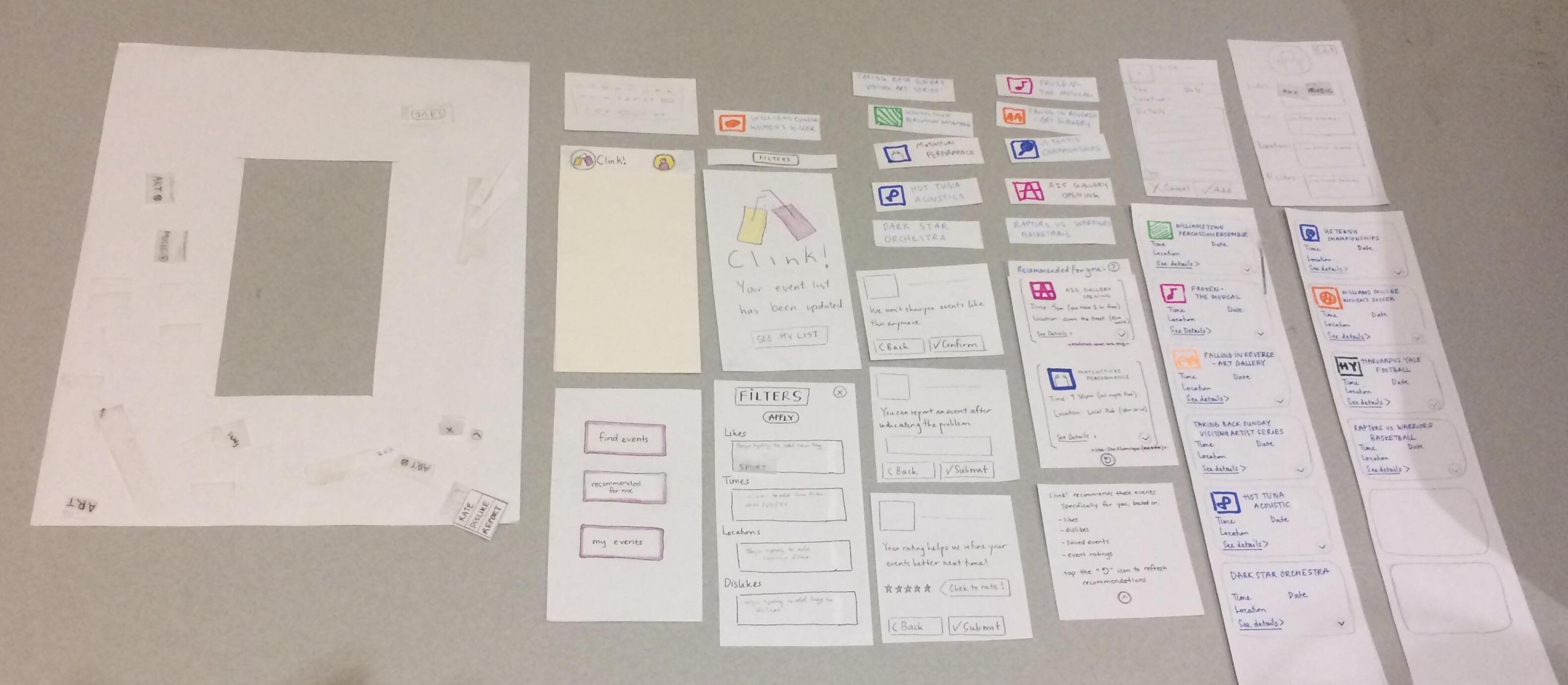
Walk through of our 2 tasks:
Task One: Filter and Find Event
To complete this task, we first click on “find events”, which navigates to the event list.
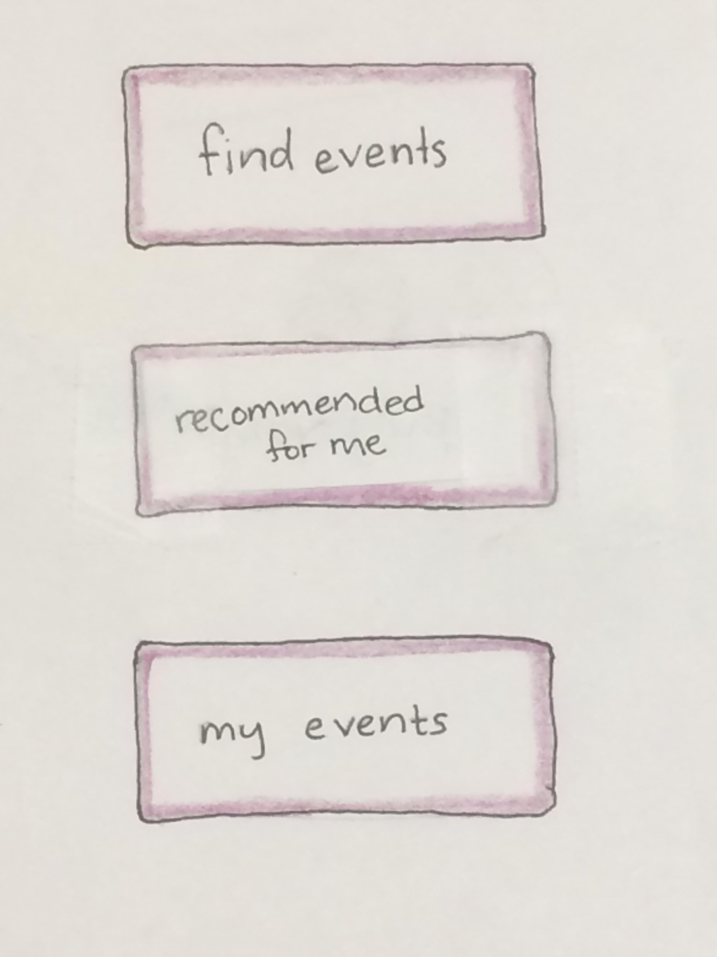
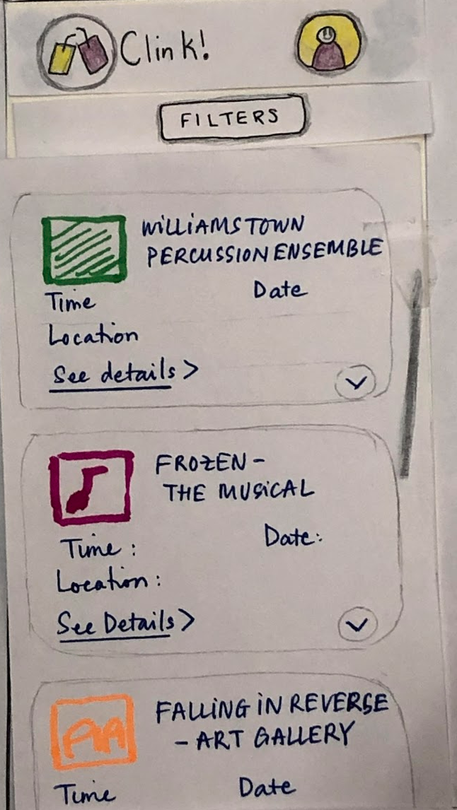
If the user would like to add a filter, they click on “filters”, which causes the revised filter page to pop up. The filters page shows their default filters, which were previously set in their profile. In this case, The filters originally applied are ‘art’ and ‘music’. In this walkthrough, the user would only like to search for sports events. They click the (x) to remove art and music filters, and begin typing “sports” to add a sports filter. They tap “apply” to save these changes. Now, only the sports filter is active.
Clicking the APPLY button on the filters menu takes the user back to the now-updated event list. It now only shows sports events.
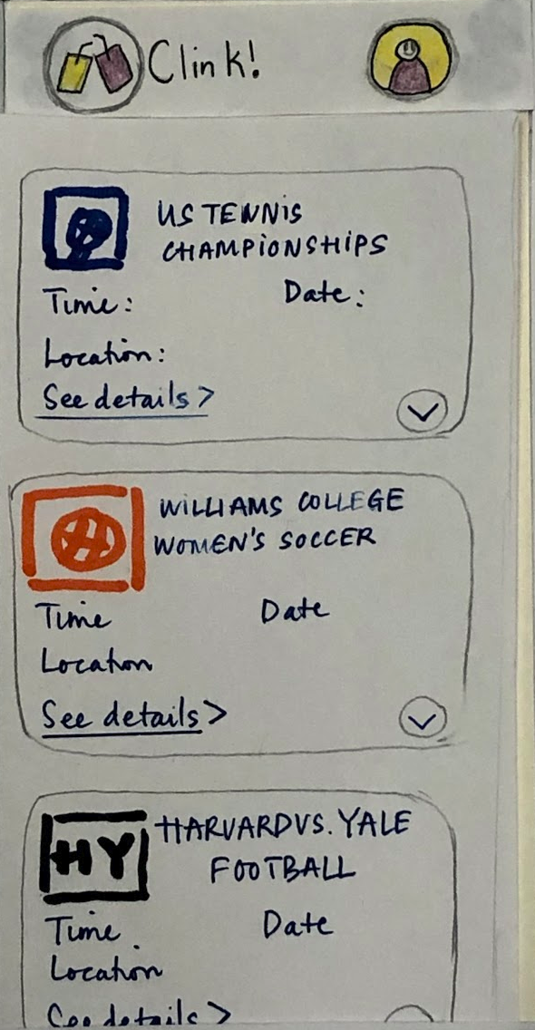
After finding a sports event that interests them, they click on it. This takes them to a page with more details about the event.
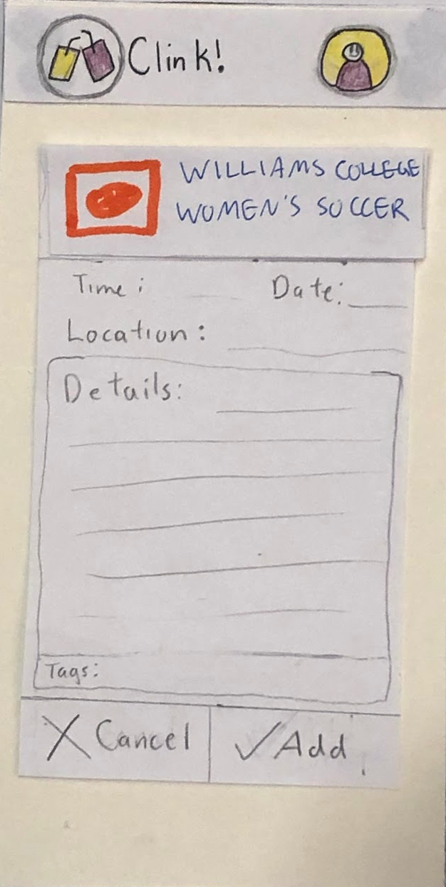
They then tap “add” to add the event to their personal event list. This causes the confirmation page to appear, which gives lets the user know the action was performed successfully.

Task Two: View Personal Event Recommendations
Tapping “recommended for me” takes the user to the personal event recommendation page. Since it was not entirely clear to the person testing our app how this feature differed than the first “find events” feature, we’ve added a (?) icon.

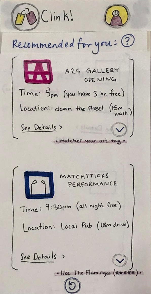
Tapping the (?) icon allows the user to get more information about what the recommendation feature is and how recommendations are generated.
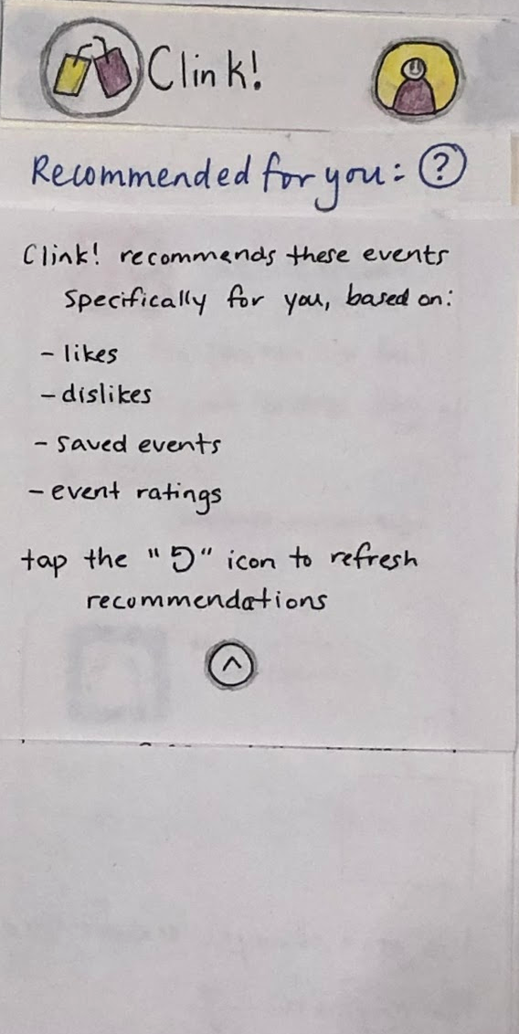
Tapping the (^) icon collapses this information box, and takes the user back to the recommendation page. From here, the user can either refresh the recommendations or view more details (and potentially add the event to their event list), as they can in the steps shown previously.
Most Important Changes to Design
1. Changing “quick find” to “recommended for me”
All three of our users have trouble with the second task (finding a recommended events) because they aren’t sure of the difference between find events and quick find. We realize that the main purpose of our recommending system is not carried across with this wording, so we decide to change it into “recommended for me”. Now, the distinction between manual looking for events, and asking the recommending system to suggest events based on the user’s calendar is made much more distinguishable.
2. Changing the position of the Apply button in Filters section
Originally when the app is designed, the apply and cancel buttons were located at the end, and have an extra cancel signifer (an X) at the top of the page. Through our first usability testing, we realize this is a source of confusion. Our user thinks that simply clicking X will apply the changes to the filter, without noticing the Apply button at the end of the filter section, which only appear when the user scrolls down. As a result, their filters are not applied. We decide to add the Apply button at the top instead, so it is clear to the user when they are making changes to the filters that they need to click Apply in order for the changes to be effective.
3. Adding textbox signifier in the Filters section
Our original design has different text boxes in which the user can type in their likes and dislikes; in these respective text boxes stored the tags of their default interests. In our first two usability tests, our users are very unsure about whether it is ok to type inside the same boxes, as they are also occupied by the tags. As a result, they think they can only change the setting inside Profile. We decide to add the signifier that the user can type in the textbox with the sentence “Begin typing your likes/dislikes/locations”. In our third usability test, the user recognizes immediately that this is a space that they can type in.