Our cognitive walk through
| problem | severity |
|---|---|
| 1. Not clear whether filters will be applied when added | 3 |
| 2. Not clear that user is meant to type in filters page | 2 |
| 3. Not clear that header icons could be clicked | 2 |
To solve problem one, an “apply” button was added to the filters page. To solve problem two, we added a keyboard component to our paper prototype. This will signal to the user that they are meant to begin typing, and then they will see the list of tag suggestions based off of the letters they input. To address problem three, we added light shading around the clickable icons. We think this will make their function more clear to users of our paper prototype. We also don’t anticipate this being as much of an issue with a digital mockup, since there will be more differentiation between buttons and text/ images.
Note: Most of these changes were not implemented until after our first usability test (the keyboard prototype piece was added prior to the user test).
Our first usability test
We conducted a usability test on Nov 6th with TN, a sophomore planning on majoring in CS at Williams. The test is carried out in Eco Cafe, since it is a quiet, convenient, and comfortable location for our tester. Phoebe took on the job as the Facilitator. She explained the general purpose of the app, the tasks, and asked TN to explain their thought process as they navigated through the app. Vy was the Computer. The app was described as a tool to help users find events they are interested in. TN was told that each user gets a profile page where they can set fixed preferences for events. They were also given a brief introduction to the recommendation system, where the app has integrated the user’s personal calender and recommends events that fit into detected blocks of free time and the user’s fixed preferences. The tasks given to TN were:
-
You are a user of the Clink app with the fixed preferences set for art and music. Find and add a sports event to your event list.
-
Add an event from the recommendation list to their event list.
TN was quick to figure out how to find and scroll through events. However, they had trouble identifying how the temporary filter page works. They also found it difficult to differentiate between “find events” and “quick find”. As for the revisions, we would need to redesign the filter page so it’s easier to understand for the users. We would also need to provide the user with more information about the “quick find” feature and explain how it differs from “find events”.
Throughout the process, we learned how import it was to keep our user talking and speaking their thoughts out loud. Whenever TN was prompted to speak, they gave us valuable insight to what they were thinking when they made a certain action or why they weren’t sure what action to take. These insights helped us develop revisions to our prototype.
We need to improve our testing process by making the changes from page to page of our prototype more smooth and quick so that our user isn’t waiting for us constantly. We should also create a more specific senario for our user so they have a better idea of what their tasks are and a more concrete purpose as they navigate the prototype.
Results from our first usability test
Negative
Incident 1: Not sure what the difference between ‘find events’ and ‘quick find’ is.
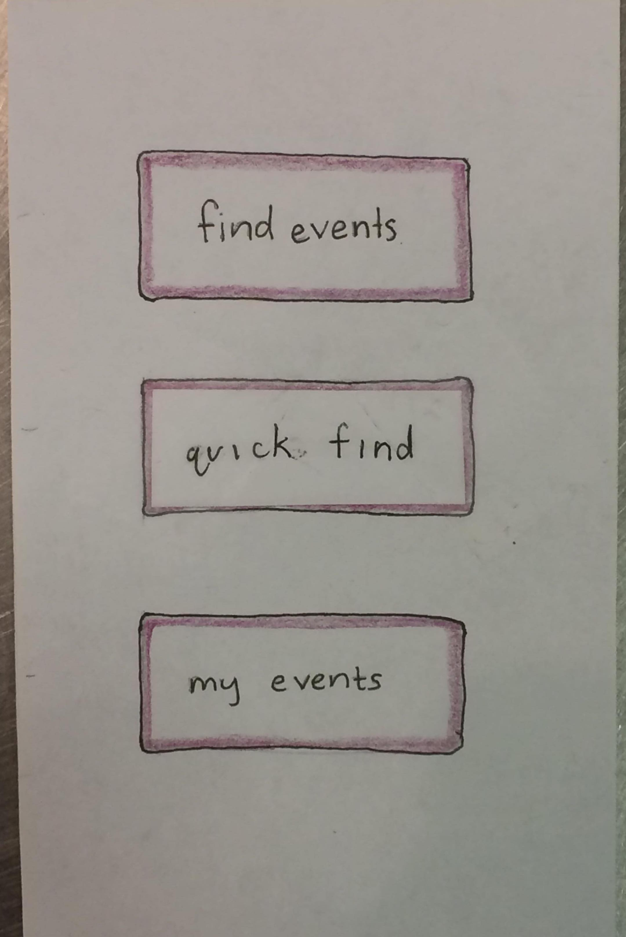
TN revealed out loud that they could not tell what the difference between the two buttons was. They tried both options in their first task. They also used “find events” in their second task because they wanted to find an event, it was what “worked last time,” they knew it held their preferences, and they assumed all the events shown would fit their schedule.
Severity of 3
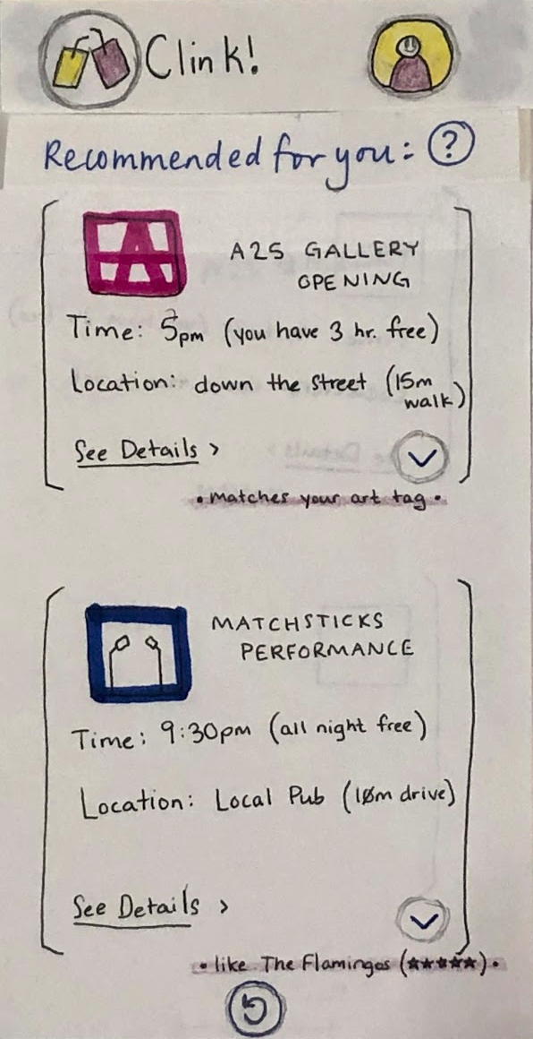
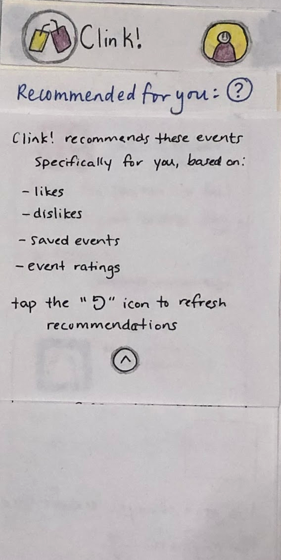 To address this, we added an “information” icon to the recommendations page. This allows the user to access a description of the feature, explaining its purpose.
Incident 2: Could not figure out how to edit the filter.
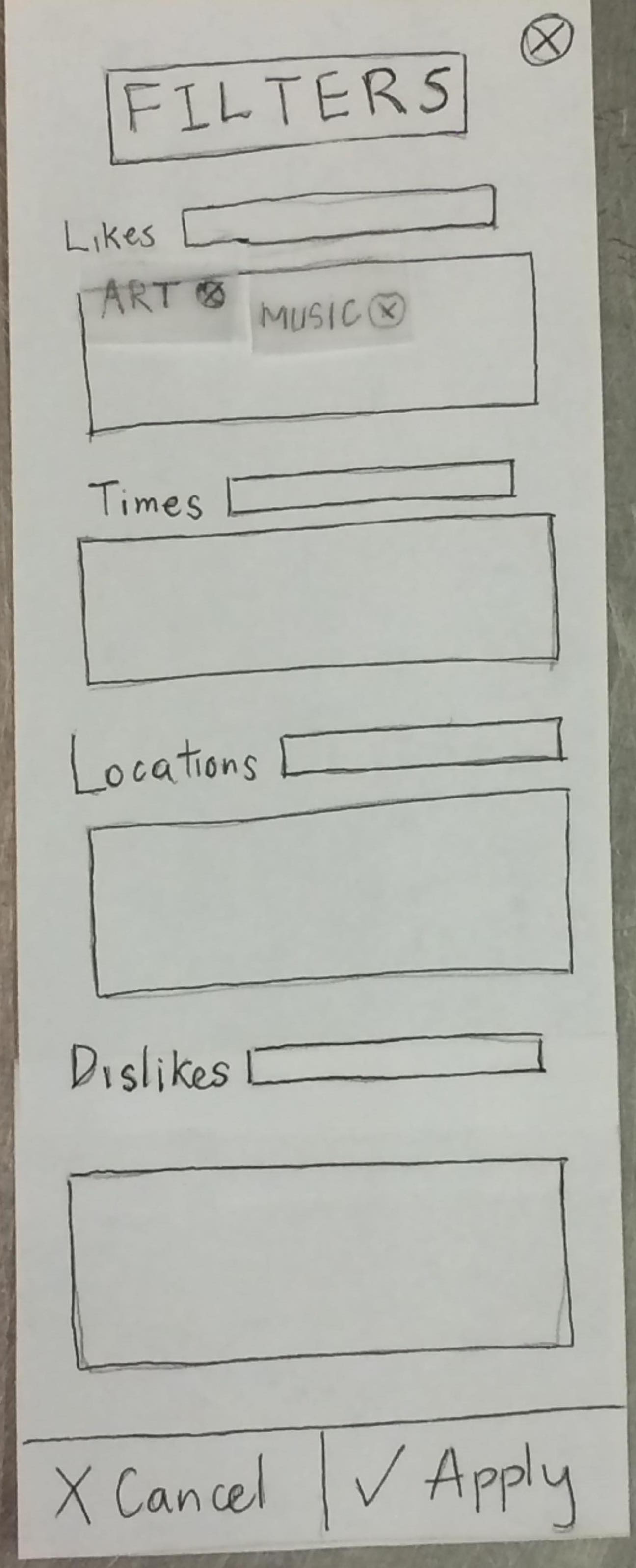
TN clicked filter, saw that it only had tags for what we mentioned was already set as a preference in the profile, and assumed that was all it was, exiting from filter to try quick find instead. The next time TN entered the filters page they had a realization that the tags on the page had ‘x’s and could be removed. They revealed to us that they ‘saw what was going on now’ and that while they thought the filter could add tags, it can only remove tags. They did not see the text box for typing and adding a new tag to the filter.
Severity of 4
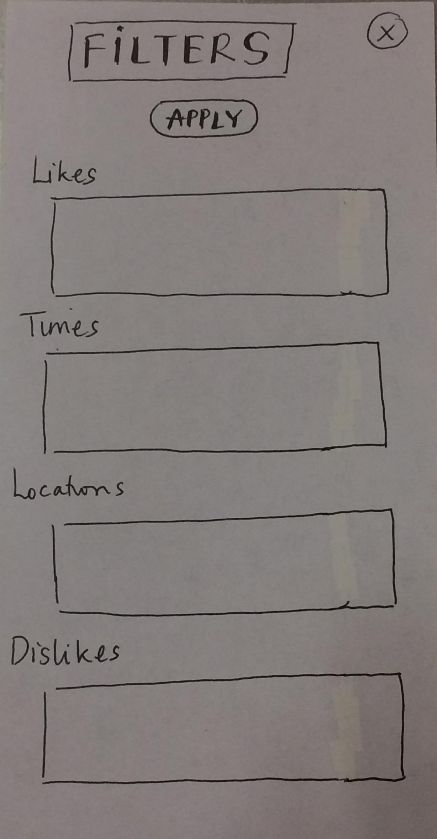 We got rid of the typing text boxes and now have one text box for both the existing tags and where users can type in new tags, similar to how the edit profile page is structured.
Incident 3: Not intuitive to find home page.
TN had trouble getting back to the home page and asked out loud how to get there. We gave a hint to guide them back to the home page: “What looks like it might take you back to the page you started on?” From there, TN clicked the header to go back to the home page.
Severity of 3
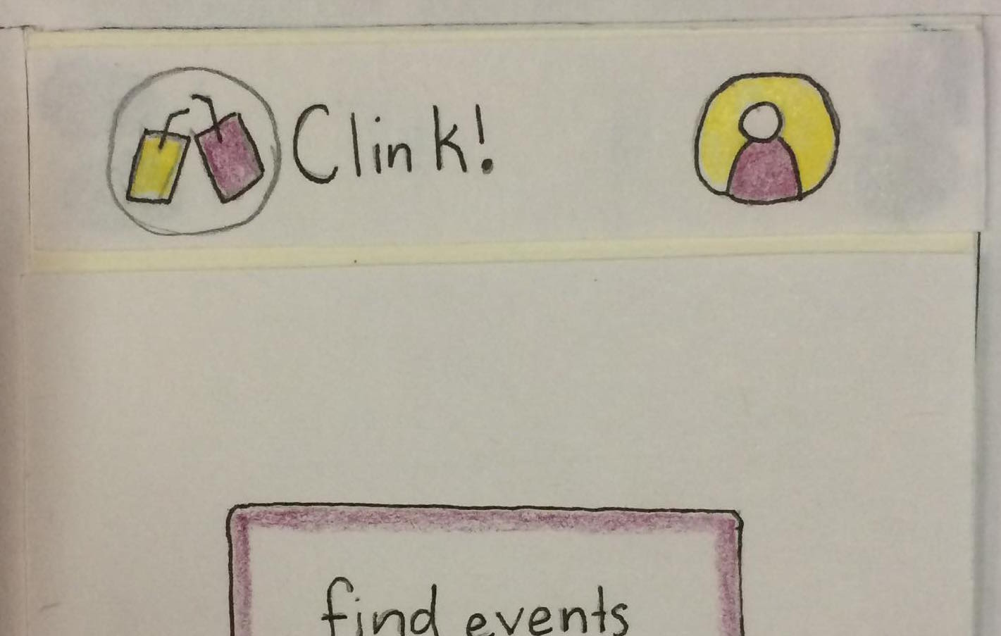
We added a circle around the logo in the header to make it appear more clickable.
Incident 4: Thought profile icon was decorative.
![]()
- TN didn’t click on the profile icon at first because they thought it was ‘purely decorative’.
Severity of 1
![]()
We made the icon more recognizable as a person by adding a smiley face to the figure.
Incident 5: Couldn’t figure out how to edit the profile.
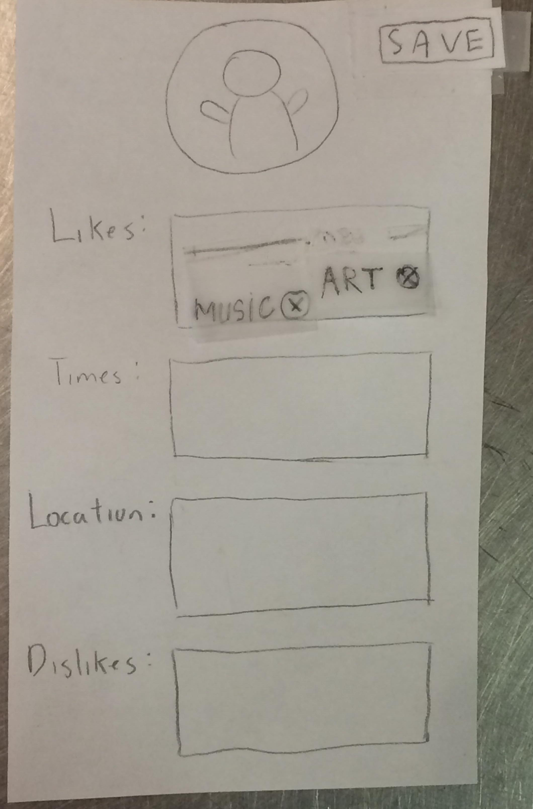
TN got to the edit profile page but could not figure out how to make an edit. We gave the hint: “Does anything look like it can be removed?” TN then clicked on the ‘x’ next to the music tag. They saved the page and revealed that they were looking for some way to make a keyboard pop up or get suggestions of tags to add. We gave them another hint: “Try going back to what you were just doing.” TN clicked edit again and tapped randomly on the page around the tags until they hit the text box and our computer revealed the keyboard.
Severity of 2
We chose not to revise the interface of our edit profile page because TN figured out how to use it and said their main issue with figuring out how to use the page was that the tags were taking up the entire interest box and made it look uneditable. In the future tests, we will be more careful in placing our tags lined up with the top and left side of the box so that it is more obvious that there is room in the box to add more tags.
Incident 6: Did not ‘apply’ changes to filter

TN did not realize the filter was scrollable and so did not realize that the filter had an ‘apply’ and ‘cancel’ button. After making changes to the filter, TN clicked the ‘x’ at the top of the filter page to exit out of it, assuming that would automatically apply the new filter.
Severity of 3
 We moved the apply button to the top of the filter so it was visible as soon as the filter was opened.
Positive
Incident 6: Scrolled down list of events.
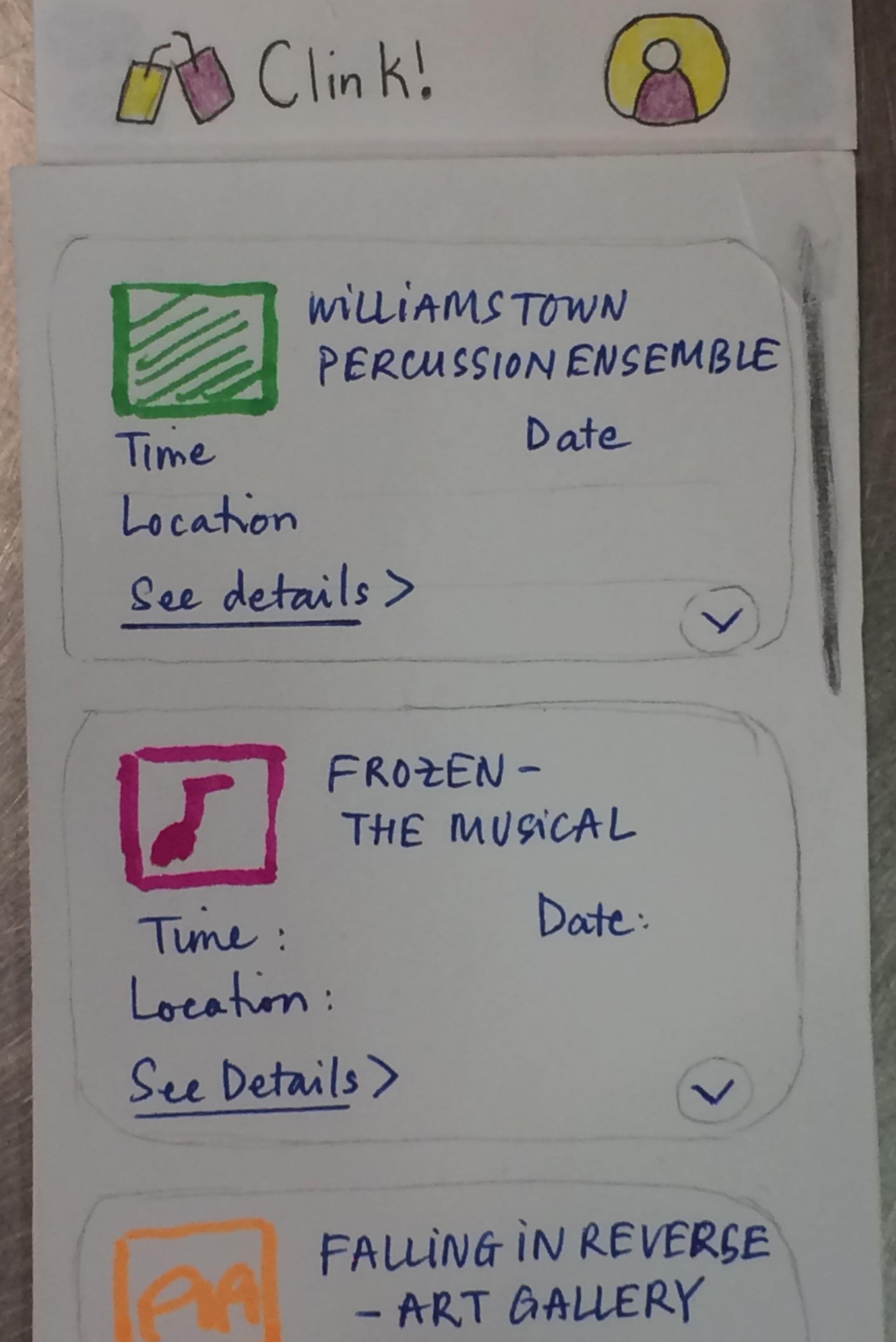
TN could tell that the list of events was scrollable and did so to find an event they liked.
Incident 7: Added event to event list.
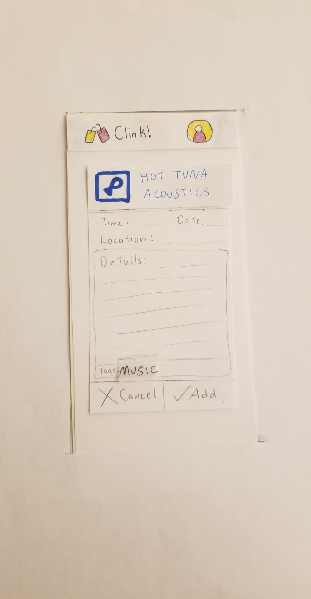
TN had no issue with getting the the more detailed page of an event and adding it to the event list.
Incident 8: Figured out how to access the ‘RATE, DISLIKE, REPORT’ menu.
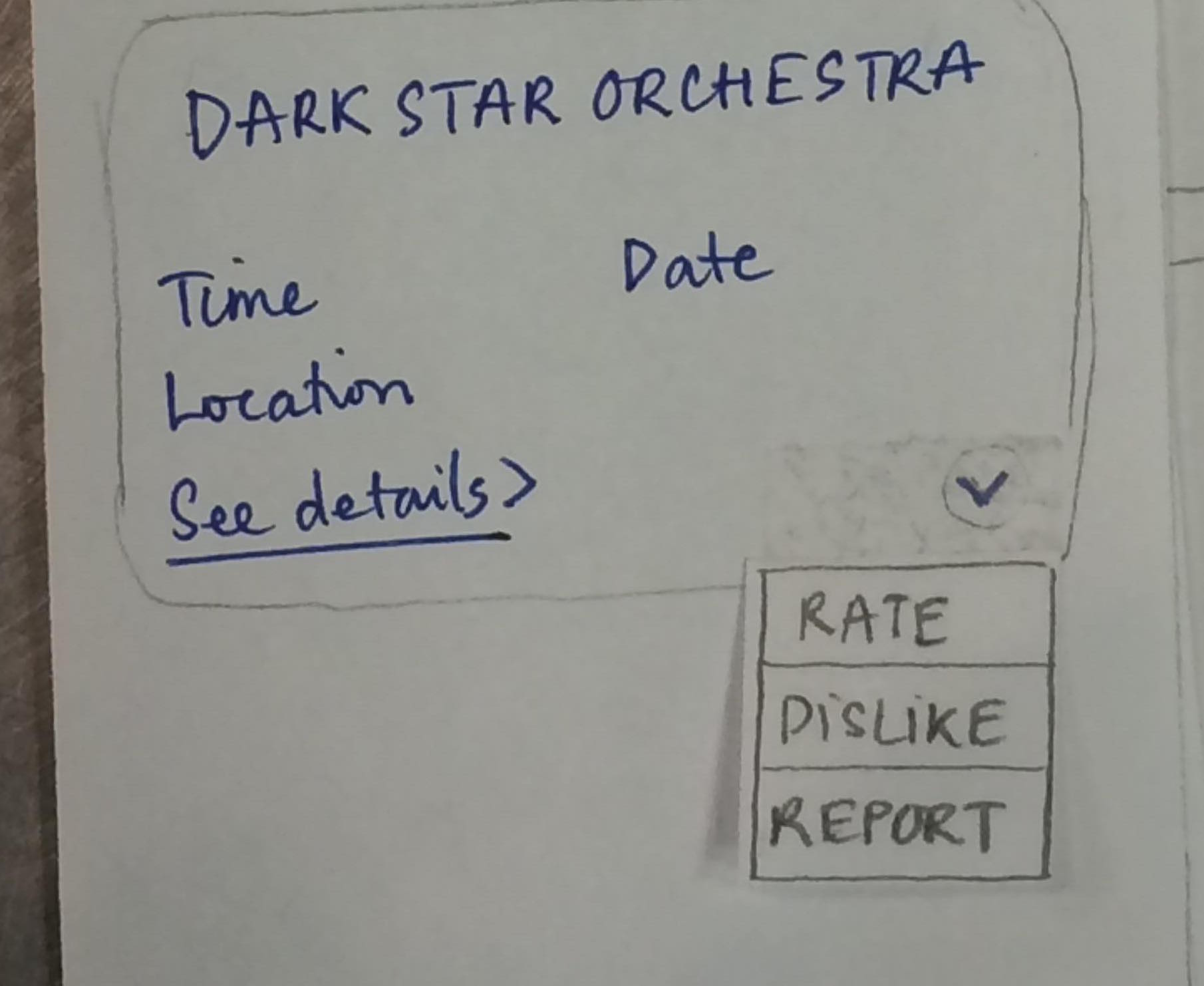
TN clicked on the drop down menu on an event out of curiosity. They could tell immeadiately what it was for and knew it didn’t have anything to do with their task so they closed out of the drop down menu without an issue.
Our plan for our remaining usability tests For the remainder of our usability tests, we plan to target another Williams student with a (planned) major in the social sciences, and an older adult who is not in the college-student age range. These two users would be able to provide different points of view about the app other than TN, who is a relatively tech-savvy user. We are also planning to have the users test our rating feature, in which, when they rate an attended event, will take note so as to recommend/not recommend it to them in the future. The current two tests, however, seem to be extensive enough to test all of the currently implemented parts of our prototype. We are still planning to have one member in the group taking on the role of a facilitator, and the other the Computer. Each team member will participate in at least 2 usability tests. As for new approaches, we would like to give a more detailed explanation of the given tasks before setting the users off to do them. It’s important to give them just enough information to understand their role and do the tasks, without giving away too much information.
Revised Prototype: Task Walkthrough
Our current revised paper prototype
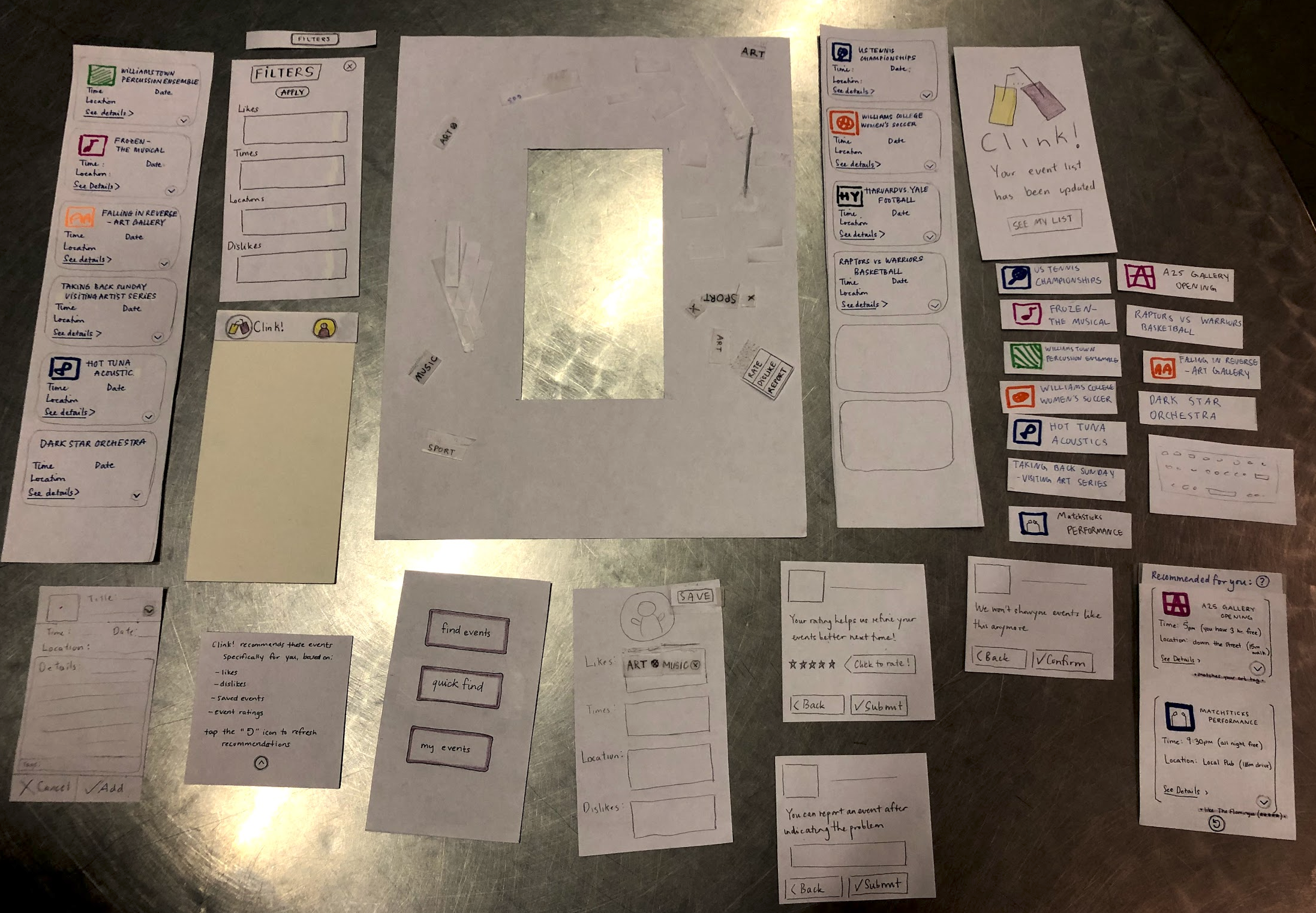
Task One: Filter and Find Event
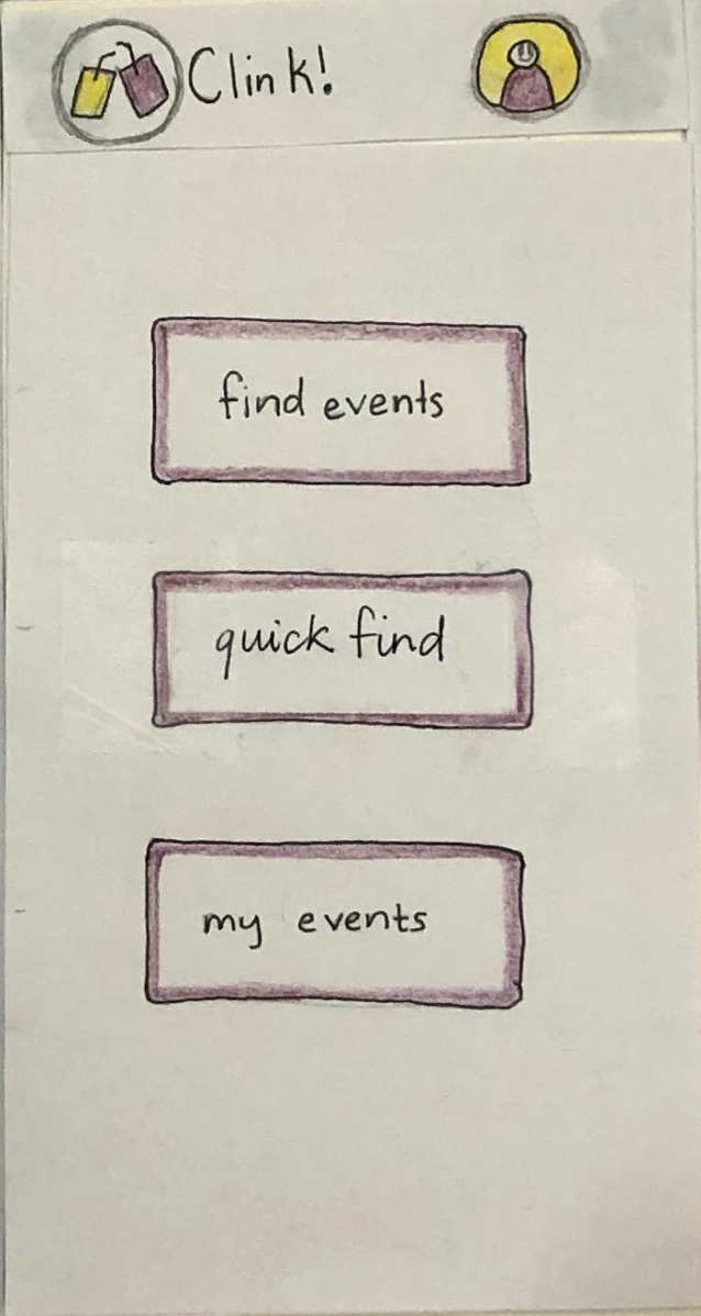
To complete this task, we first click on “find events”, which navigates to the event list.
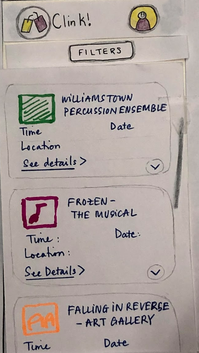
If the user would like to add a filter, they click on “filters”, which causes the revised filter page to pop up. The filters page shows their default filters, which were previously set in their profile. In this case, The filters currently applied are ‘art’ and ‘music’.
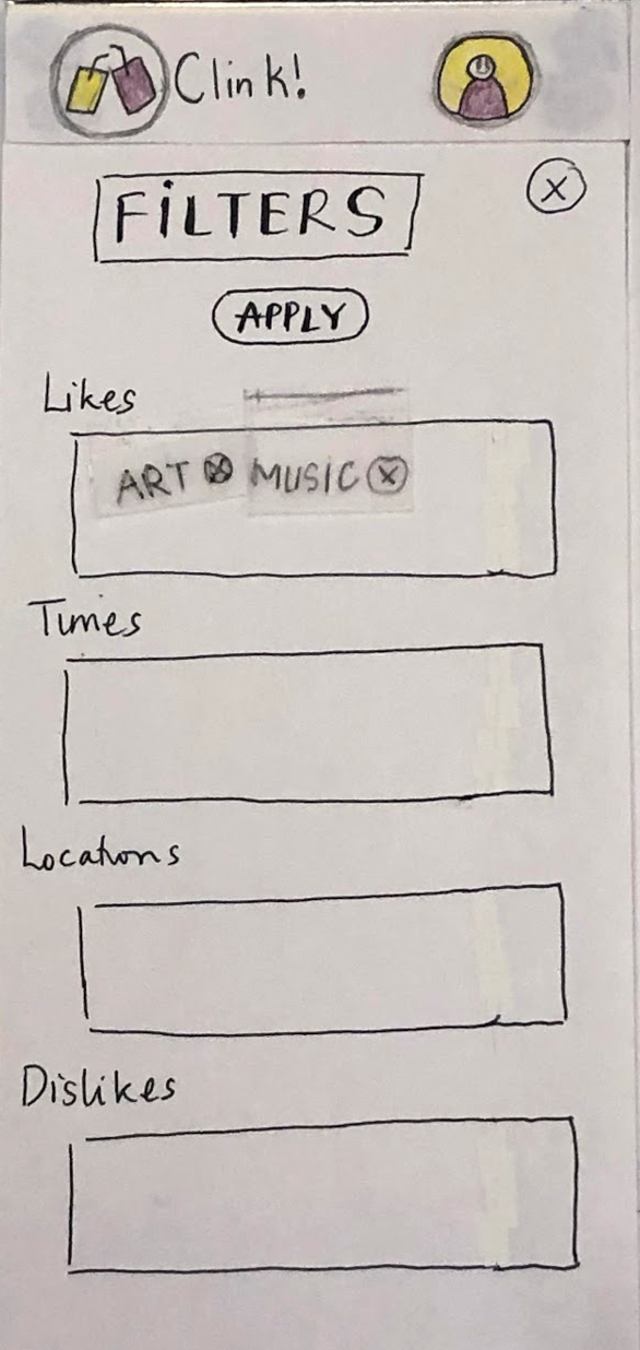
In this walkthrough, the user would only like to search for sports events. They click the (x) to remove art and music filters, and begin typing “sports” to add a sports filter. They tap “apply” to save these changes. Now, only the sports filter is active.
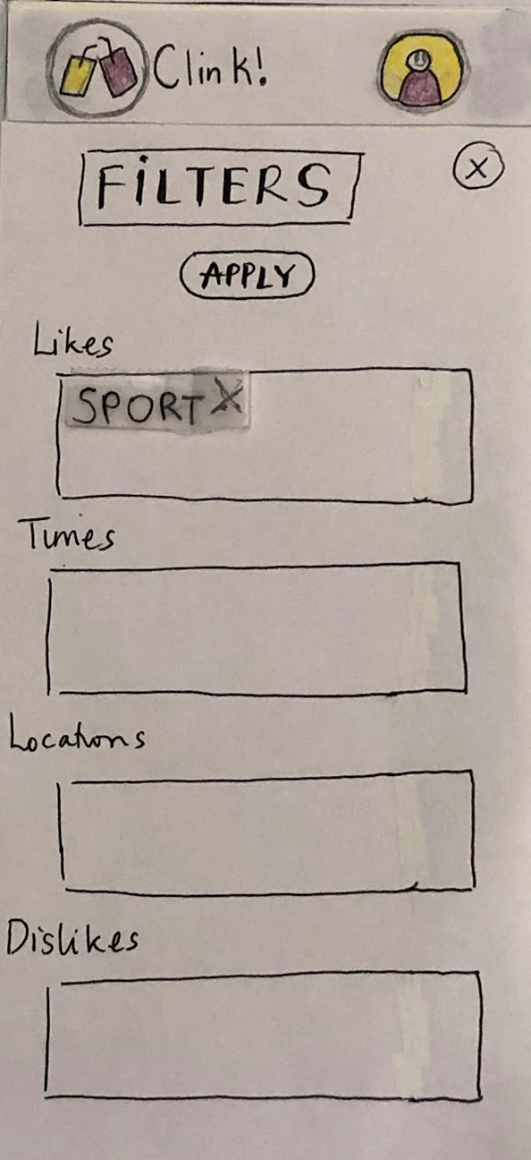
Clicking the (x) on the filters menu takes the user back to the now-updated event list. It now only shows sports events.
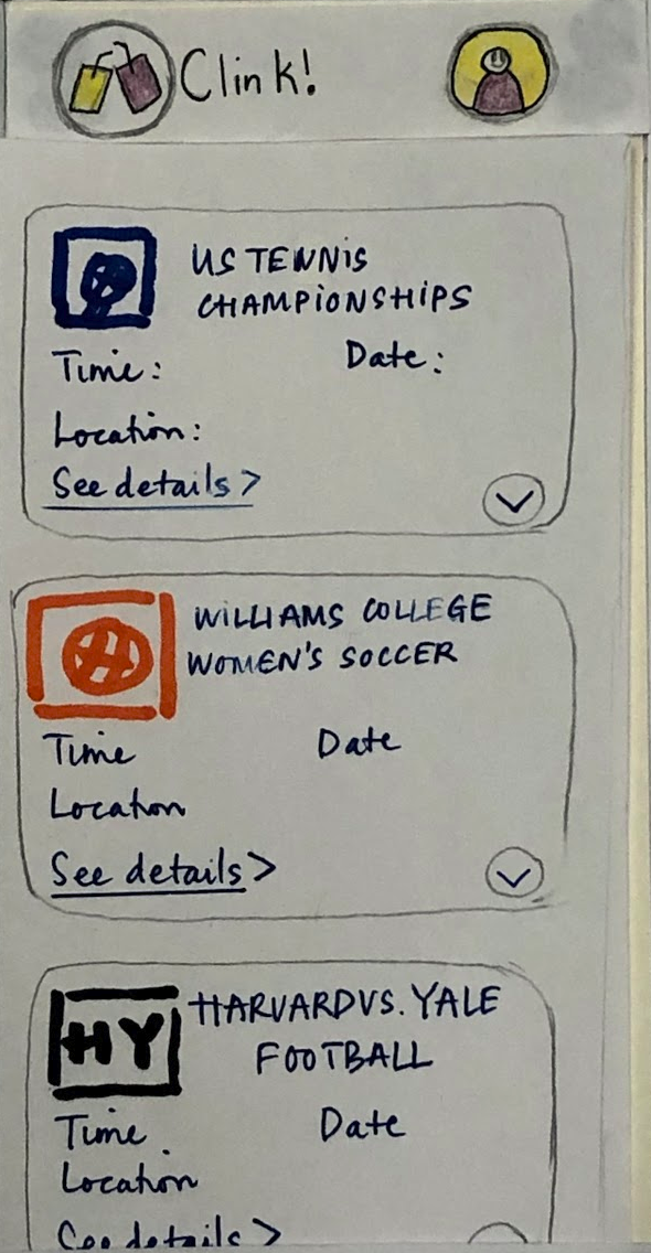
After finding a sports event that interests them, they click on it. This takes them to a page with more details about the event.
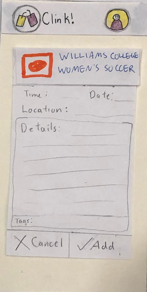
They then tap “add” to add the event to their personal event list. This causes the confirmation page to appear, which gives lets the user know the action was performed successfully.

Task Two: View Personal Event Recommendations
Tapping “quick find” takes the user to the personal event recommendation page. Since it was not entirely clear to the person testing our app how this feature differed than the first “find events” feature, we’ve added a (?) icon.


Tapping the (?) icon allows the user to get more information about what the recommendation feature is and how recommendations are generated.

Tapping the (^) icon collapses this information box, and takes the user back to the recommendation page. From here, the user can either refresh the recommendations or view more details (and potentially add the event to their event list), as they can in the steps shown previously.