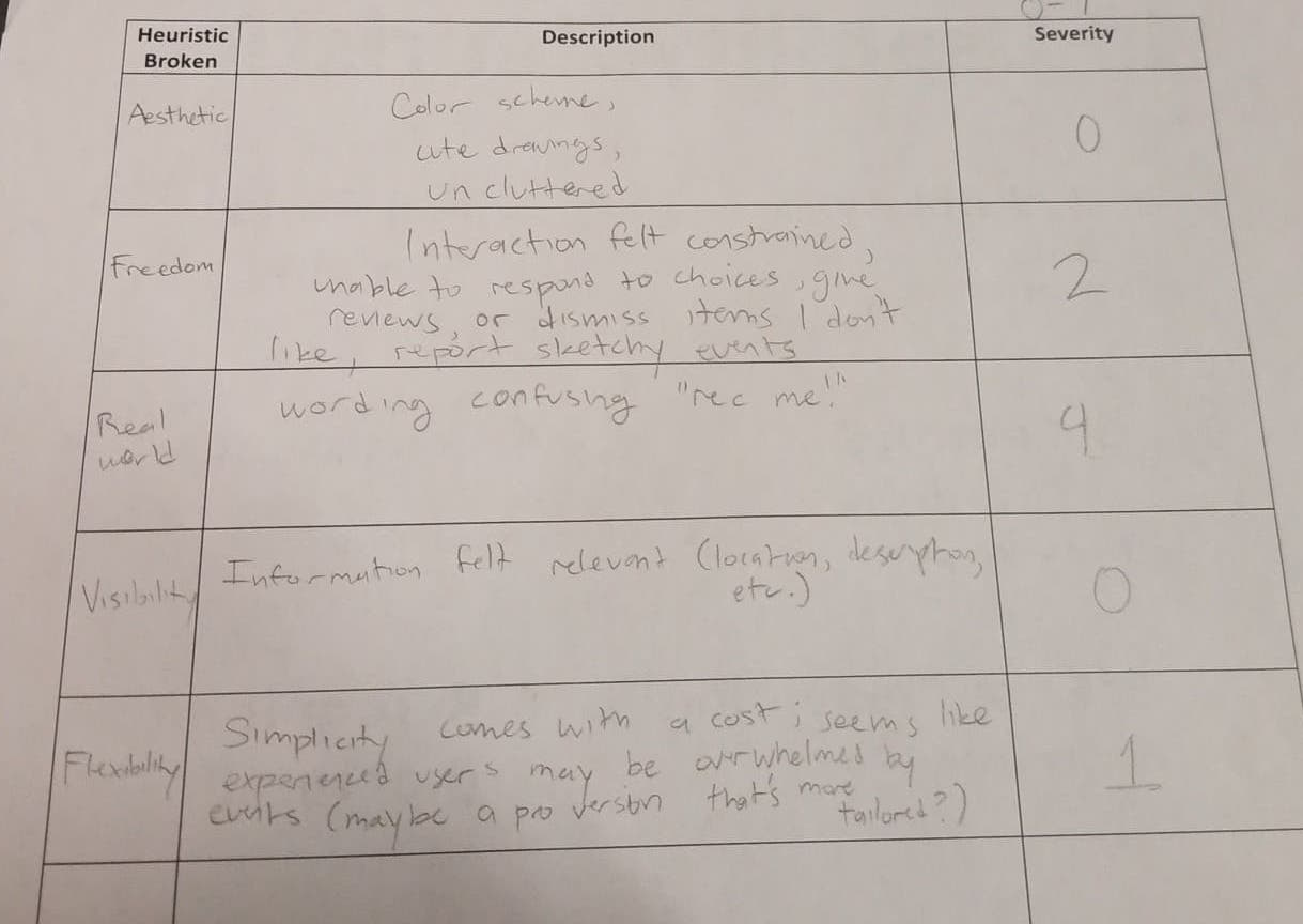
Vy conducted the first evaluation with Geoffrey (severity was rated out of 7 and adjusted to a scale of 0-4 for our table).
Michaela and Phoebe conducted the second evaluation with Liv (severity was rated out of 10 and adjusted to a scale of 0-4 for our table).
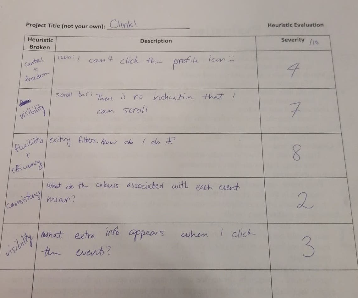
This table shows the feedback received from the participants in our evaluations. Positive comments are left in and are marked with the related heuristic, but the severity of the comment is marked as 0.
| # | Heuristic Broken | Description | Severity |
|---|---|---|---|
| 1 | Aesthetic | Color Scheme, cute drawings, uncluttered | 0 |
| 2 | Freedom | Interaction felt constrained, unable to respond to choices, give reviews, or dismiss items I don’t like, report sketchy events | 1 |
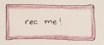
| 3 | Real World | wording confusing “rec me” | 2 |
| 4 | Visibility | Information felt relevent (location, description, etc.) | 0 |
| 5 | Felxibility | Simplicity comes with a cost; seems like experienced users may be overwhelmed by events (maybe a proversion that’s more tailored?) | 1 |
| 6 | Control + Freedom | Cannot click the profile icon | 2 |
| 7 | Visibility | There is no indication that the scroll bar can be used | 3 |
| 8 | Flexibility + Efficiency | Exiting filters: How to do it? | 3 |
| 9 | Consistency | What do the colors associated with each event mean? | 1 |
| 10 | Visibility | What extra information appears when the event is clicked | 1 |
Issue #1: Not an issue
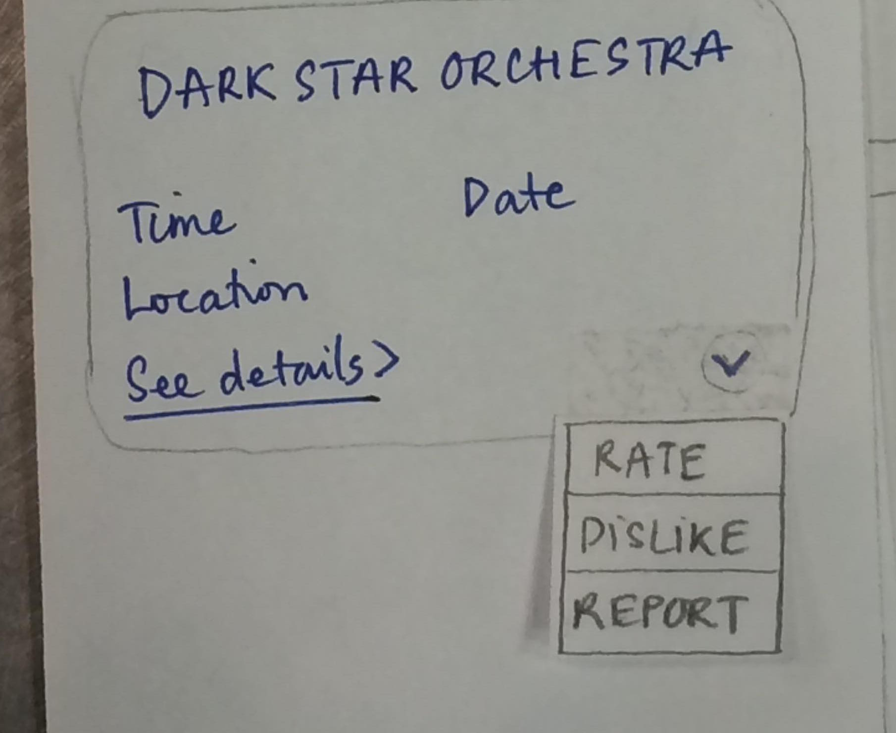
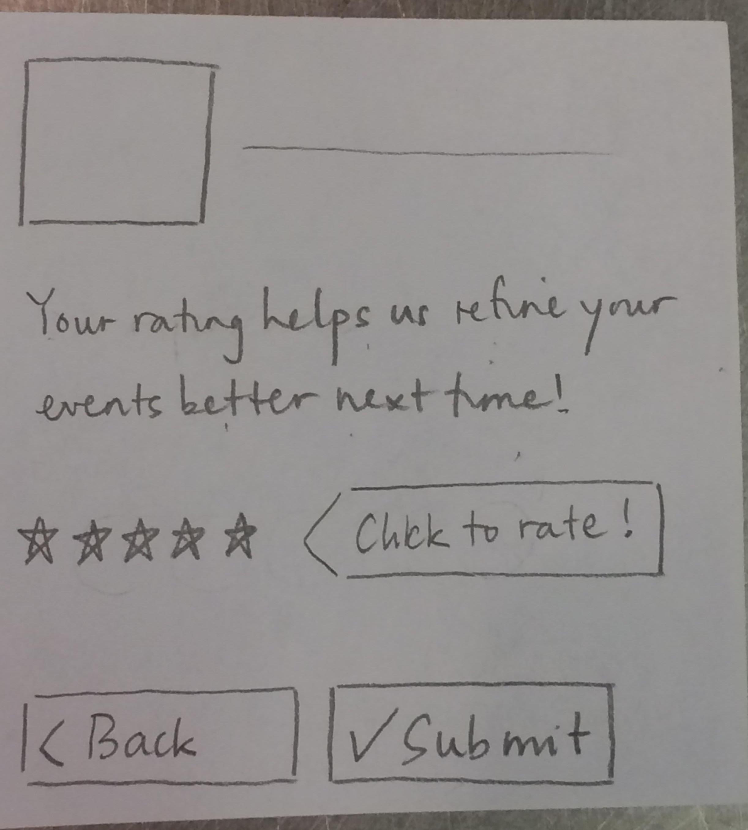
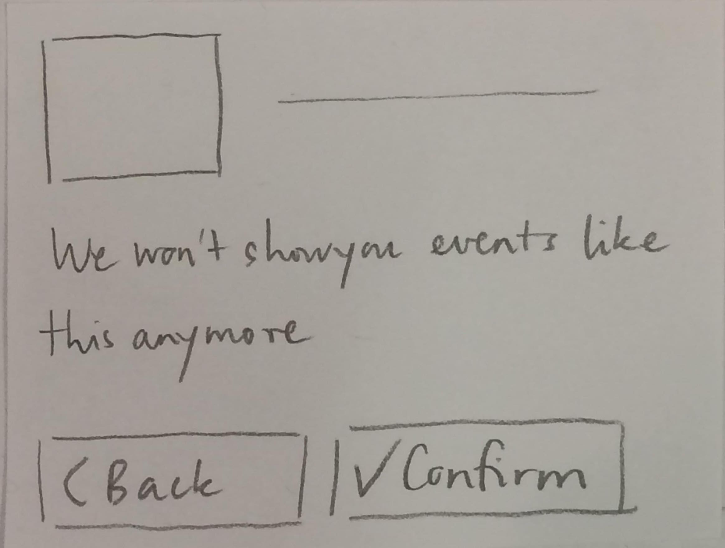
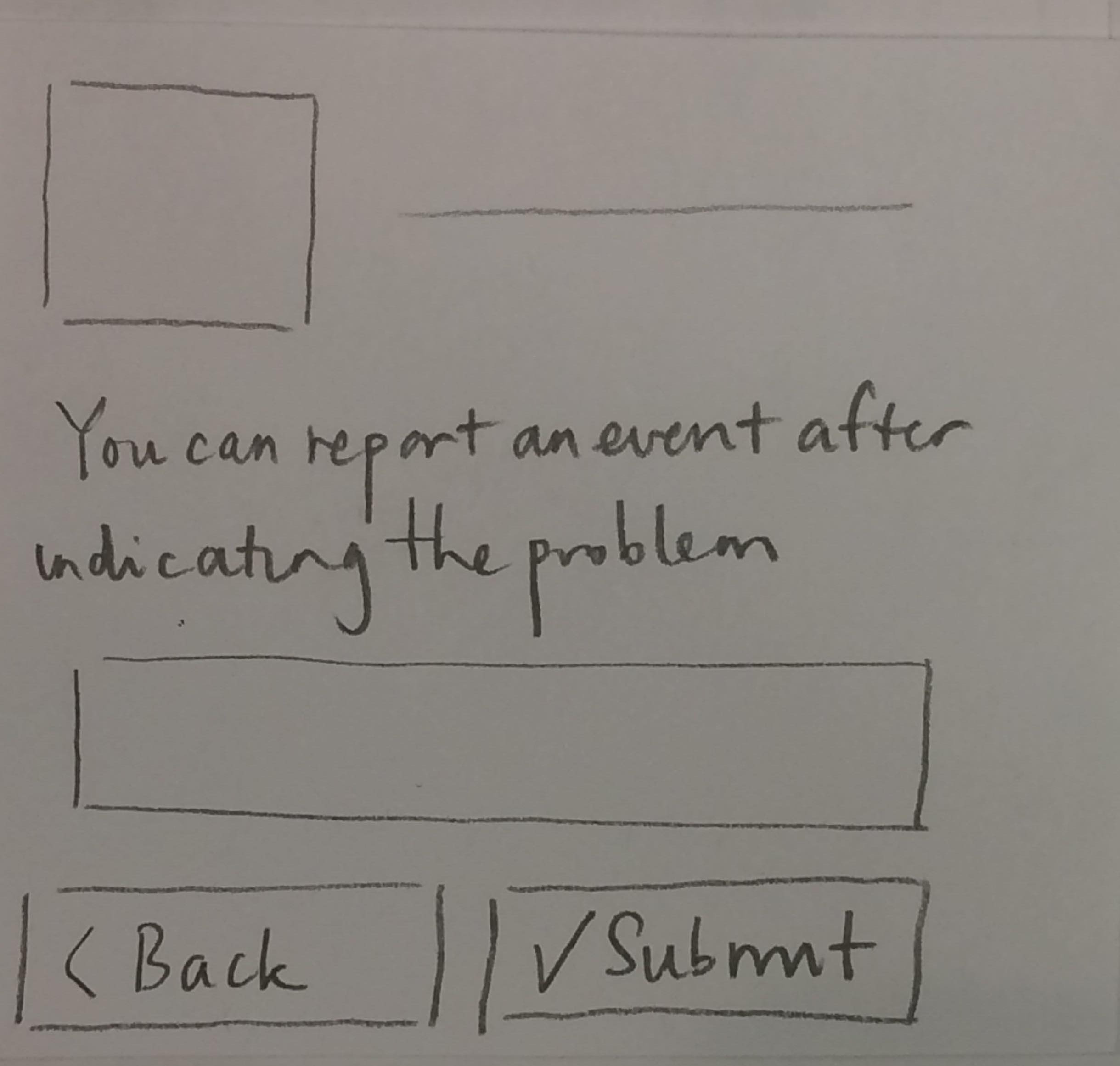
Issue #2: “Interaction felt constrained, unable to respond to choices, give reviews, or dismiss items I don’t like, report sketchy events”
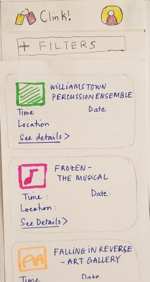
To address this concern, we implemented all additional functionalities in our paper prototype. Previously, we had only implemented features directly involved with the execution of our two main tasks. We agree that this left functionality far too limited, did not let a user of the paper prototype fully experience the app, and thus did not allow for very comprehensive feedback on the app as a whole.
.jpg)
Our Revision:
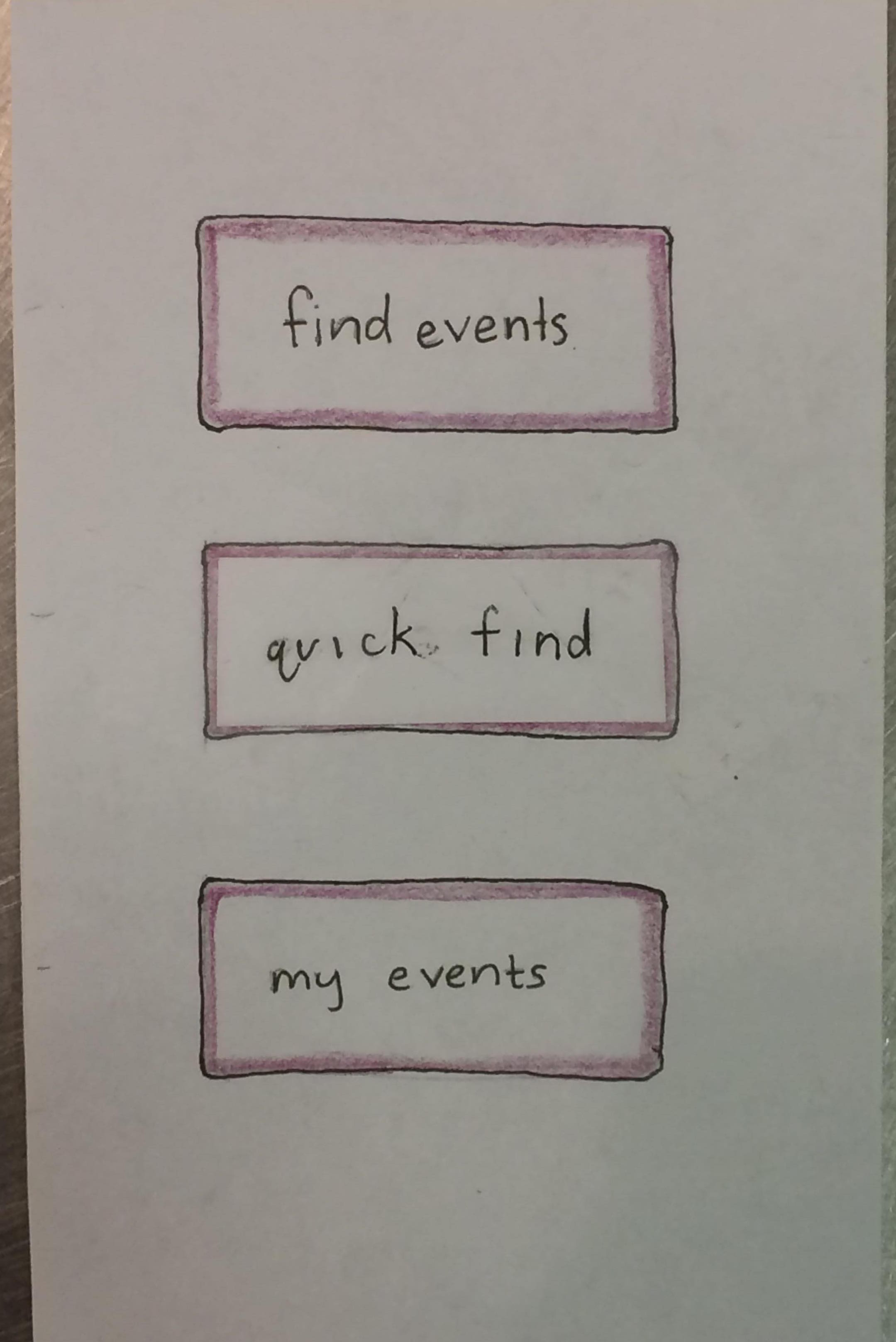
Issue #3: “Wording confusing: “rec me””
To fix this issue, we changed the phrasing of our recommendation button to “quick find”.
Our Revision
Issue #4: Not an issue
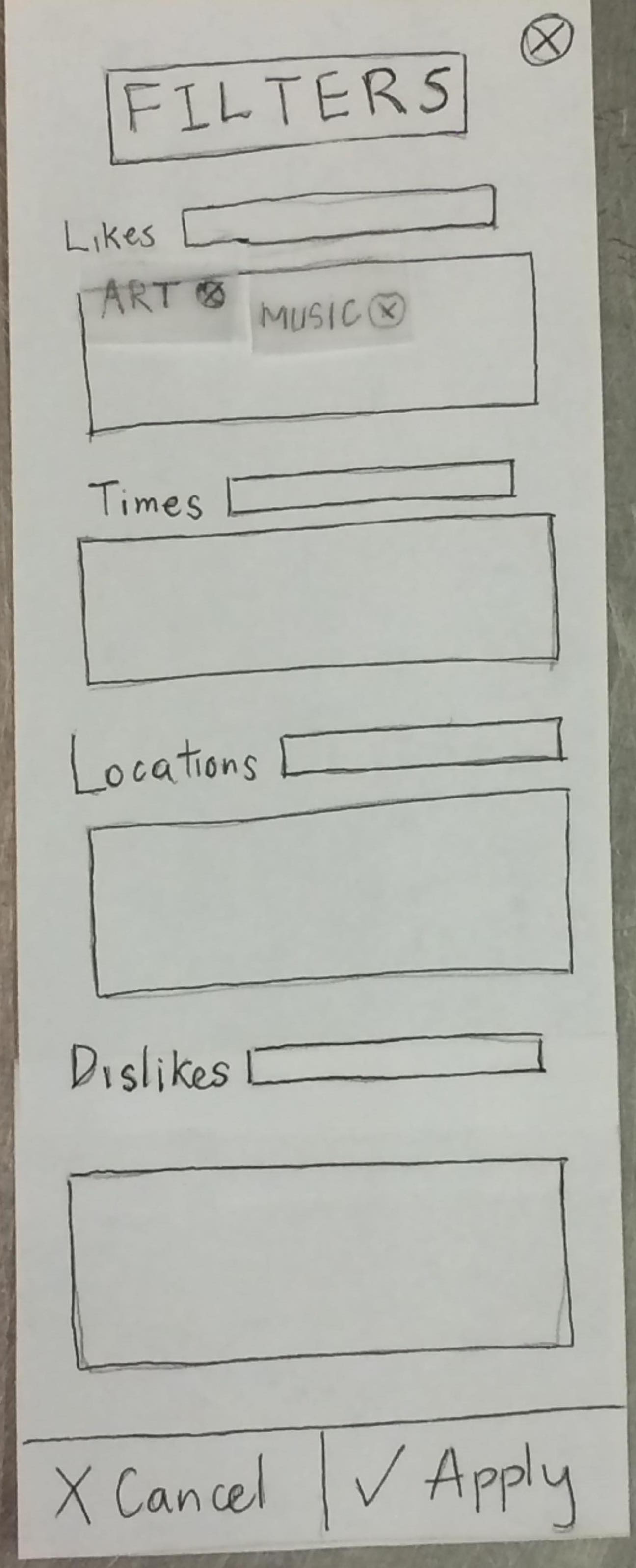
Issue #5: “Simplicity comes with a cost; seems like experienced users may be overwhelmed by events (maybe a pro version that’s more tailored?)”
To address this, we added much more detailed filters. This will allow users more flexibility in how they choose to search through events and limit the options that are shown to them.
Our Revision
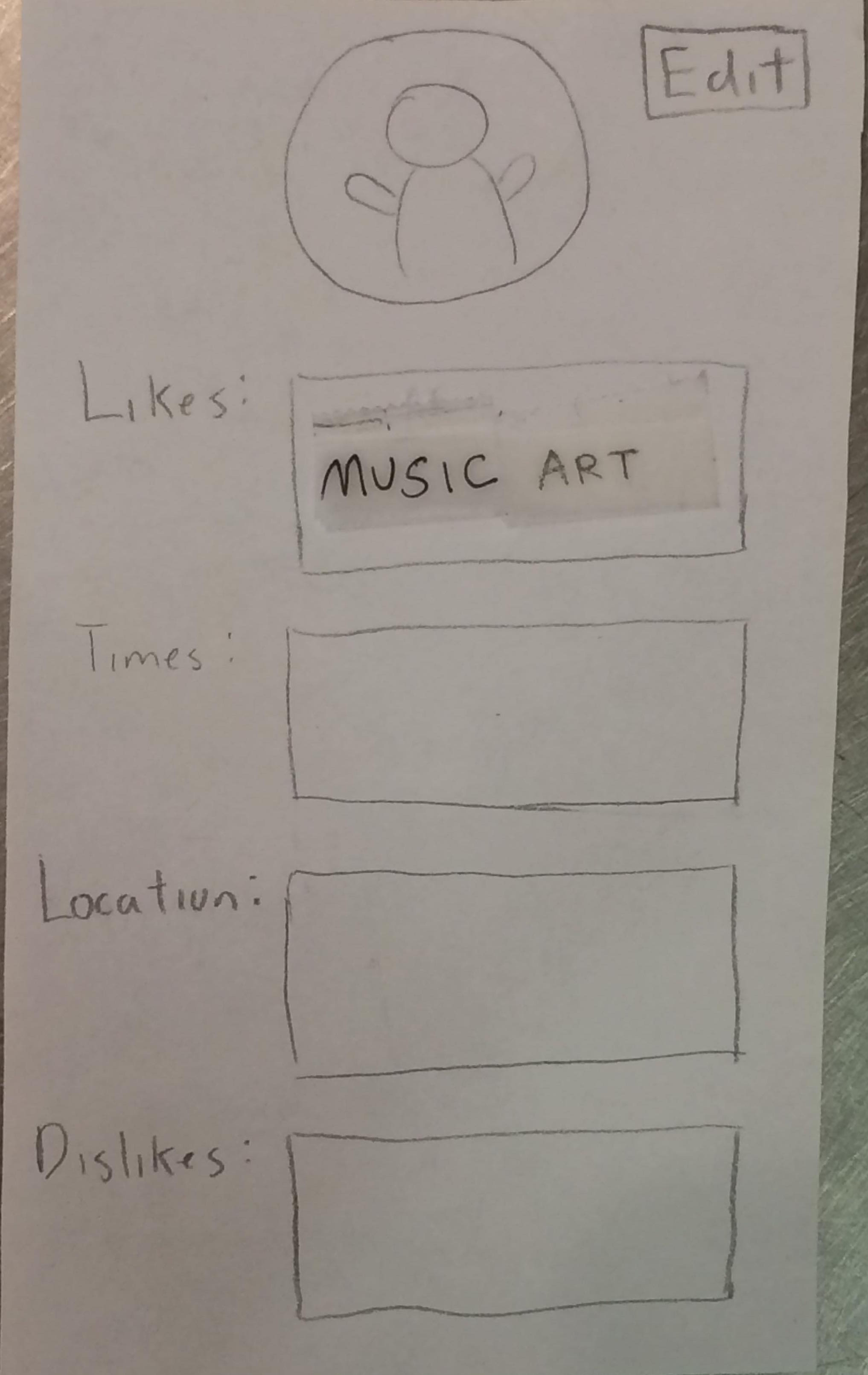
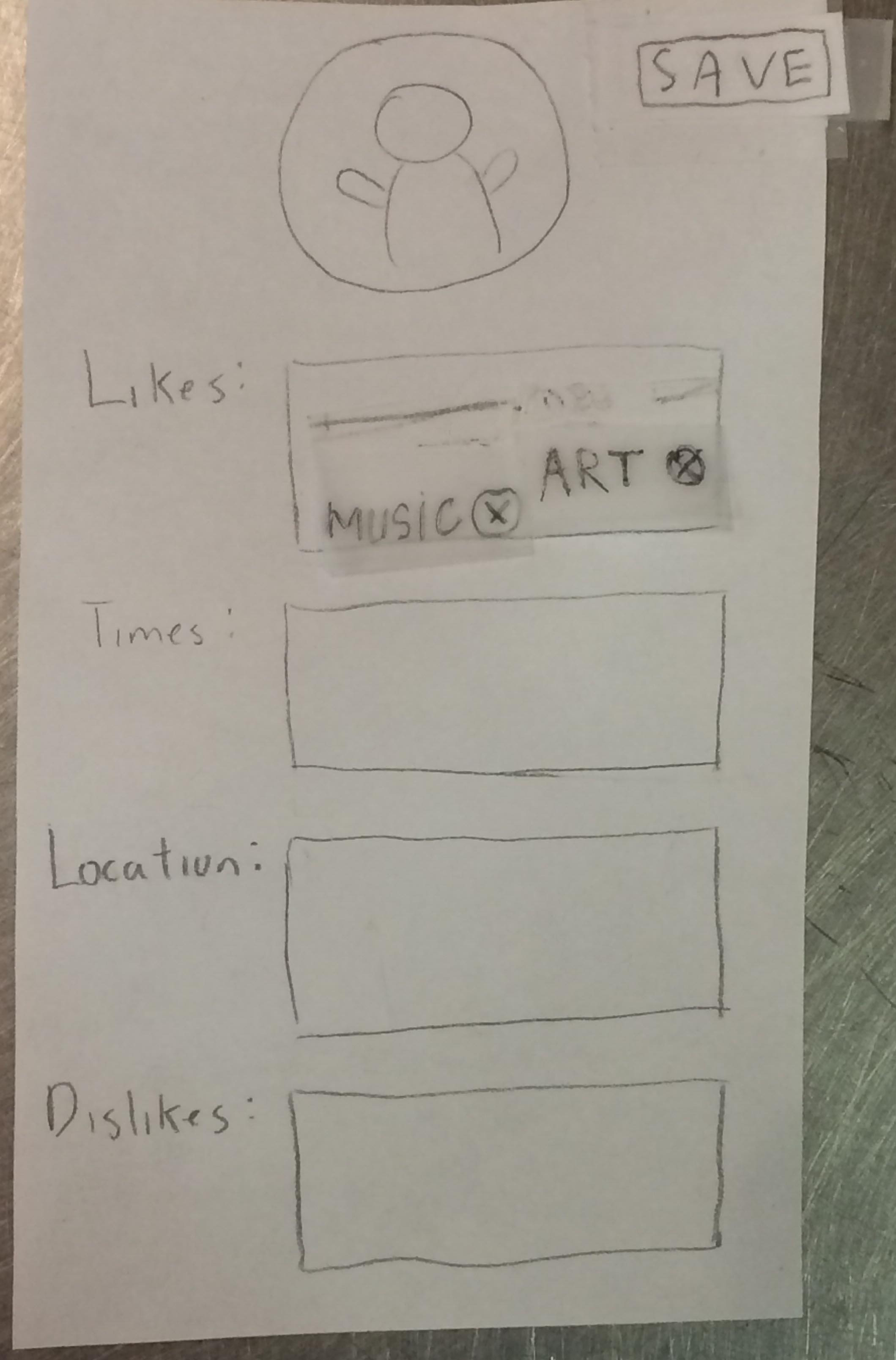
Issue #6: “Cannot click the profile icon”

Our Revision
Issue #7: “There is no indication that the scroll bar can be used”
To address this, we added a scroll bar.
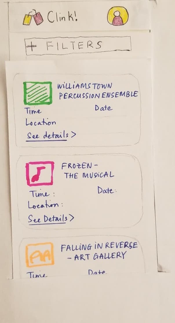
Our Revision

Issue #8: “Exiting filters: How to do it?”
In response to this, we added a clear (x) on the corner of the filter menu.
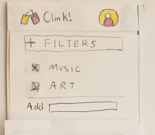
Our Revision
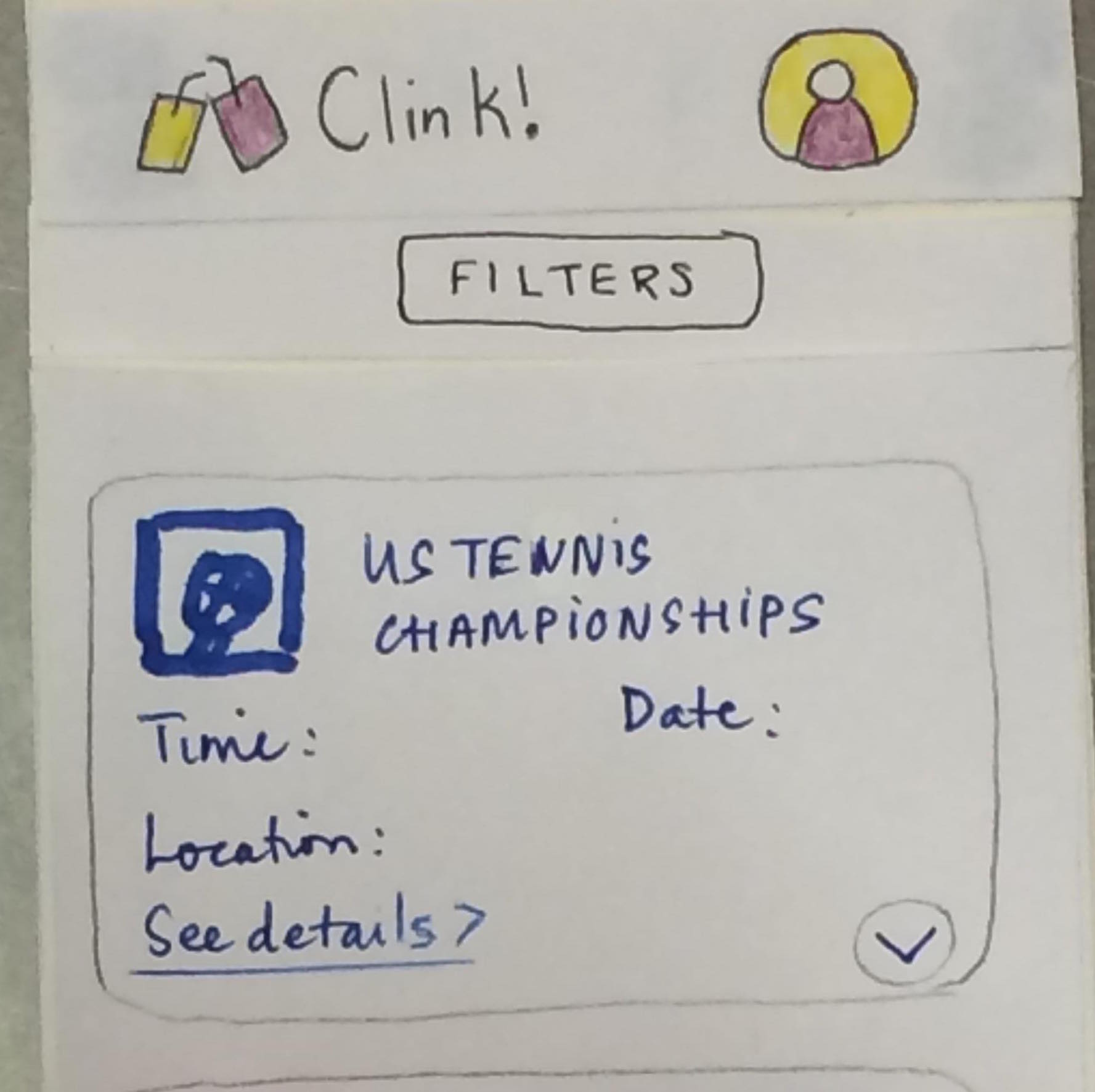

Issue #9: “What do the colors associated with each event mean?”
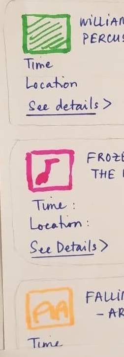
No Revision: We did not feel a revision was necessary here, as the color does not have any significance. The icons are just placeholders to demonstrate that the creators of events would be able to add thumbnail images.
Issue #10: “What extra information appears when the event is clicked”
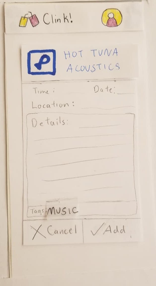
No Revision: We did not feel like a revisions was necessary for this comment. The prototype of the details page shows the fields of information that will be shown, and it would not be helpful to write out descriptions for every possible event in our prototype.