Which design and tasks, and why?
The tasks that we chose are manually searching for events based on interest, and giving event recommendations based on user interest and time availability. We chose these tasks because they are the most central to what we hope to accomplish: connecting people with community events. The first allows the user to perform a manual search themselves. This would be done when they want to personally survey their options and optimize their event choice, or if they are looking for some very particular kind of event. The second task focuses on giving recommendations that meet the specifications users lay out with regards to their personal interests, and suggests only the top matches for the user. The recommendation system integrates with the user’s personal calendar, so that recommendations are only made for events during times that the user is free and able to attend. Both the recommendation and the search are limited to the events meeting the interest, duration, and other specifications that the user has outlined in their profile.
We chose our third, mobile design for it’s minimal layout and clear progression from one task to another. It clearly displays what features users can engage with, including the tasks that are central to the purpose of the app as well as the supporting features, such as personalization of one’s profile to include what event specifications and search parameters should be the default.
What makes this design best suited to the people you are targeting with your design?
The mobile element of the design is very important, because it is focused on people who are busy and often on the go. The target audience is people who do not have time to sit and comb through all possible options, as a web design with a more complex interface might allow for. Our audience, by contrast, would be best served by a design that limits the amount of information they are exposed to, and displays the limited selection in a clear, simple way, as this one does. Our interviews and CIs have shows us that reducing information overload is important, as main things that discourage people from searching through event options are the sheer volume of events that aren’t interesting to them and the amount of effort that it takes to find ones that they’d want to attend, both in terms of availability and interest.
Why are these tasks more compelling than others?
Clink! was born from the idea that most people suffer from information overload when looking for events and activities to attend. Our contextual inquiries revealed that there were many sources of information available, but people tend to miss events they like because they have to scroll past so many events they don’t like. Having Clink! presort a list of events to only show ones that match your interests should simplify this process and be a feature everyone who wants to attend events can use. Based on the feedback we got from Glow and our in class discussions, people thought the event recommendations based on time availability and user interests would be an interesting feature. Thus, we included it as one of our two main tasks so that we could explore the idea more. It also ties in very well with our first featured task. The difference between the two tasks we chose are that the recommendation system automatically chooses an event based on user availability and preset preferences, while the searching feature shows all events that fit the user’s preferences and also allows the user to manually narrow or widen the search with additional filters and see all options. Both tasks are heavily focused on personalizing the activity finding experience for Clink! users, with varying degrees of manual effort.
Storyboards
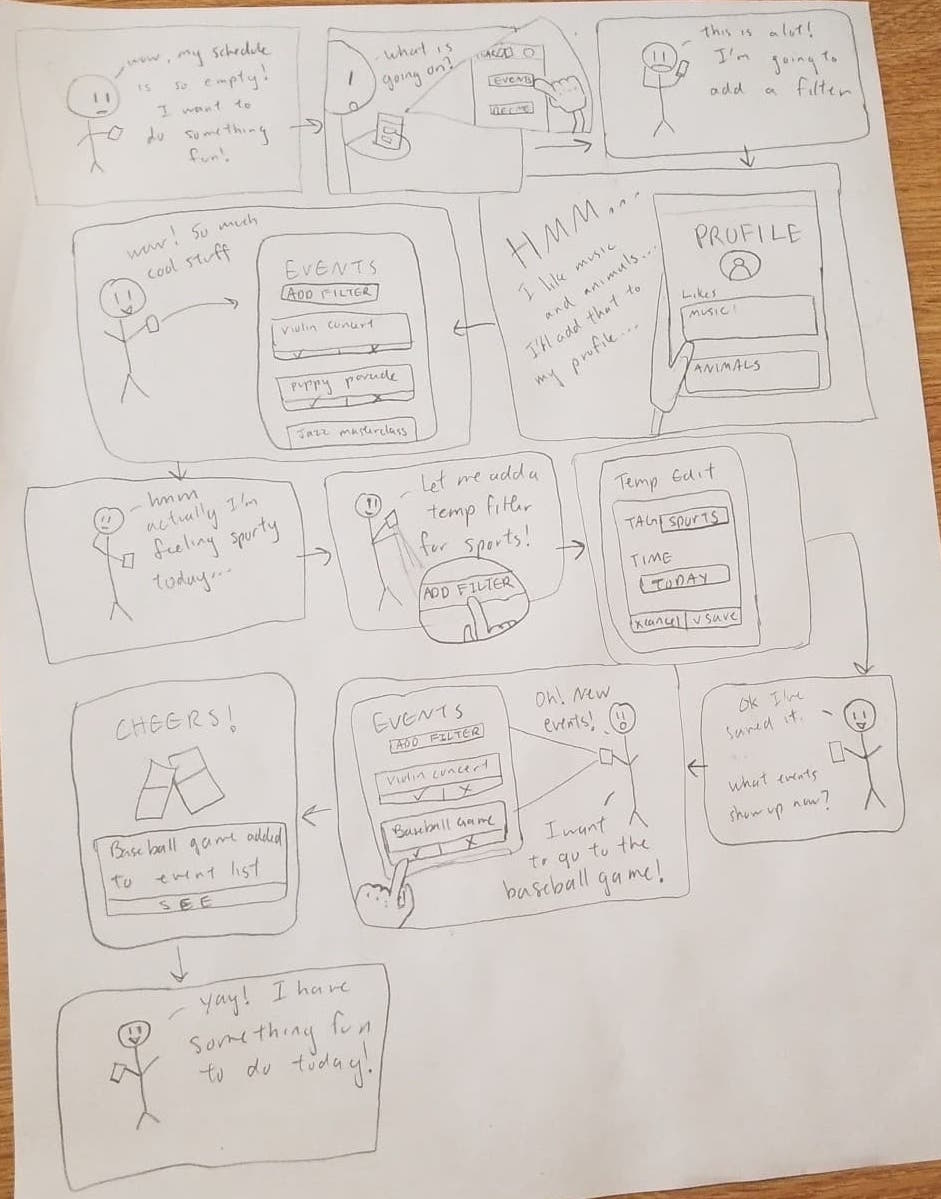
Storyboard 1 shows a person who has an empty schedule and wants to fill it with an activity. They use Clink! to check what events are going around them. Since there are too many events that show up, they add some filters to their profile so Clink! can show them only events related to their interests, which are animals and music. They also usually don’t go to sport events but are feeling unusually sporty today so they add a temporary sport filter. Clink! then shows them all events that relate to animals, music, and sports. They check the events available again and see a baseball game they want to go to. They add the baseball game to their event list and now they have something fun to do today!

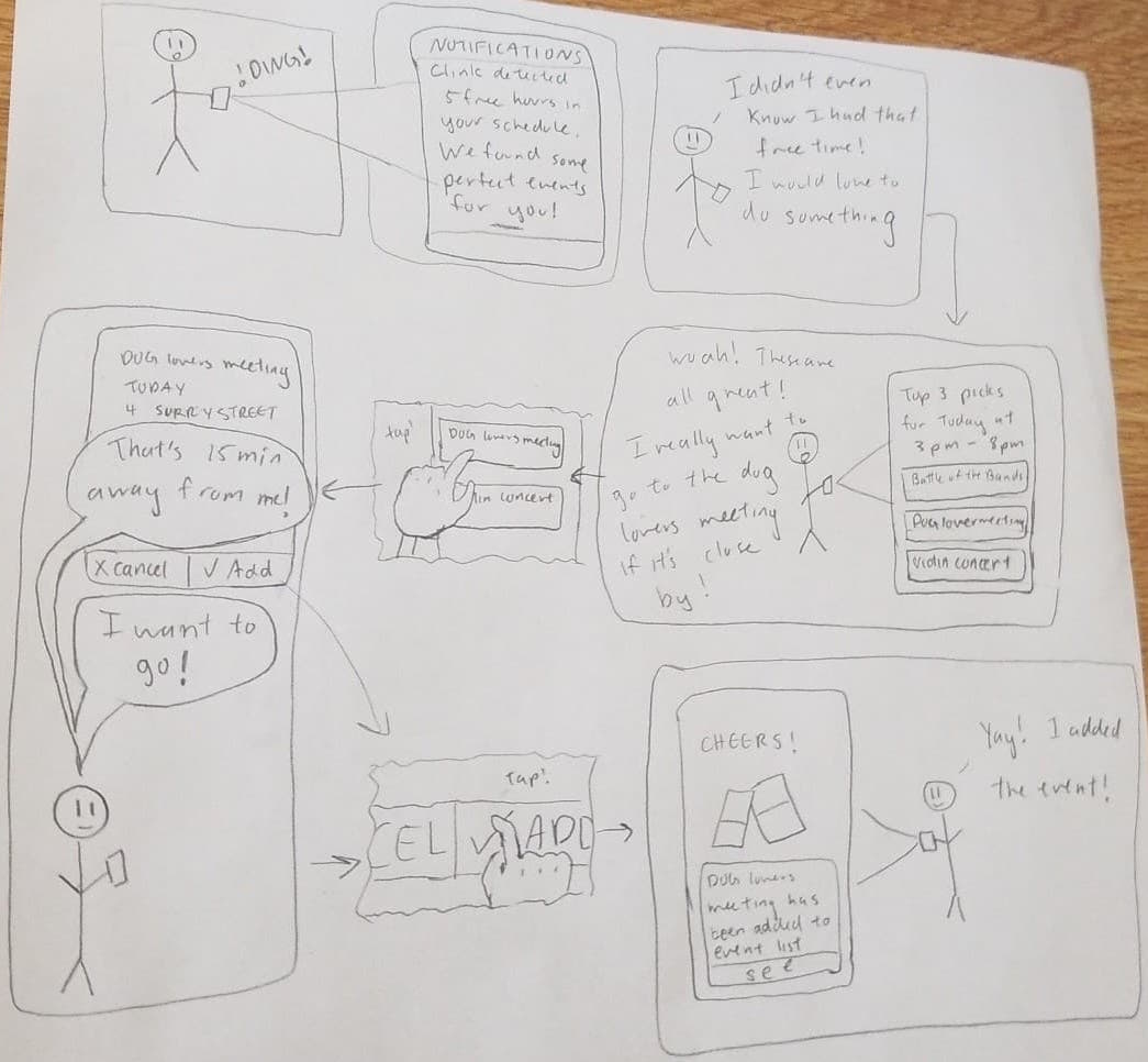
Storyboard 2 shows the same user getting a notification from their phone. The notification lets them know that Clink! found a 5 hour chunk of free time in their schedule and has found some activities that would fit perfectly into that slot. The user taps the notification and is taken to a Clink! app page with three event suggestions that fit their interests and time constraints in their profile and schedule. The user sees a dog lovers meeting that sounds interesting and taps on it to check event details, since they only want to go if it is close by. It turns out the event is close by! They then add it to their event list. They now have a fun event to go to!
